Health Outcomes: How does Indiana compare to the rest of the country?
January 31, 2025
PAER-2025-05
Author: Laura Montenovo, Assistant Professor of Agricultural Economics
![]()
![]()
![]()
![]()
![]()
In this report, I highlight trends in health outcomes in Indiana compared to the rest of the United States. The main takeaways:
- Despite most health outcomes in Indiana aligning with the U.S. averages, the numbers reveal some non-negligible differences between Hoosiers’ health outcomes and national trends.
- Across the country, there is geographic variation in health outcomes and differences between rural and urban areas.
- Indiana’s percentage of uninsured individuals is 1.5 percentage points lower than the nation, on average.
- Based on 2019-2021 data, Indiana’s life expectancy is almost two years lower than the national one for the same period.
- In the United States, county-level uninsurance rates and life expectancies move in a moderately strong opposite direction, but such a relationship does not arise in Indiana counties.
A Variety of Health Outcomes
County Health Rankings is a program of the University of Wisconsin’s Population Health Institute. As part of this program, the Institute publishes health data for local areas in the U.S. to allow for analyses of health trends and disparities within and across communities.[1] Although I will discuss state-level averages here, including both rural and urban areas, the data includes county-level numbers, allowing for much more granular analyses.[2]
Based on 2024 data,[3] the percentage of Hoosiers with fair or poor health was about 16%, more than one percentage point higher than the U.S. average. In Indiana, 18% of the population reports being smokers, compared to the 15% national average.
The obesity rate in Indiana this year is 33.6%, about three percentage points higher than in the U.S. overall. The share of physically inactive Hoosiers can partially explain this discrepancy, as 25% of Hoosiers claim to be physically inactive, while the national average is two percentage points lower (23%). Because only 76.5% of people in Indiana have access to exercise opportunities versus 80.6% nationally, easing access to physical exercise opportunities may be a valuable policy objective in Indiana.
Another common determinant of overweight and obesity rates is the accessibility and affordability of healthy food. This includes proximity to grocery stores, cost barriers, and accessibility to healthy foods more broadly. The lack of such accessibility generates food deserts, making it harder for people to consume healthy foods consistently. The Food Environment Index,[4] which summarizes such accessibility, is slightly lower for Indiana (6.8) than in the U.S. (7.5), potentially explaining part of the discrepancy in the Indiana and national obesity rates.
Healthcare providers are scarcer in Indiana than in the nation. A common way of measuring the availability of healthcare providers is to compute the number of individuals in a geographical area relative to the number of healthcare providers in the same area. In Indiana, for each primary care physician and each dentist, there are 200 more individuals than in the United States. For each mental health provider, there are over 150 more Hoosiers compared to the U.S. These numbers suggest that there are more people for each healthcare provider in Indiana than in the U.S. on average, implying relatively lower accessibility to healthcare professionals in the state.
The rankings also point to higher teen birth rates in Indiana (20.2%) than in the U.S. (16.9%) and a higher rate of preventable hospitalizations among Hoosiers. In this case, the discrepancy with the U.S. average is about 500 preventable hospitalizations per 100,000 individuals. Such a difference may be surprising if one notes that the percentage of annual Medicare enrollees with the annual flu vaccination is 4% higher than the U.S. average (50% in Indiana versus 46% nationally).
Despite Indiana’s percentage of excessive drinking aligning with the national one (~18%), the percentage of driving deaths with alcohol involvement in Indiana is over ten percentage points lower than in the U.S. (28.7% versus 18.3%).
Health Insurance Rates and Life Expectancy
Using an interactive tool[5] produced by NORC[6] as part of an initiative supported by the CDC,[7] I report below two maps, one for Indiana and one for the United States. The maps include data on life expectancy, that is, the average number of years a person can expect to live,[8] and the percentage of people without any health insurance, whether public or private.
Indiana has a slightly lower percentage of uninsured people than the U.S. (8% in Indiana vs 9.5% nationally), and it has a lower average life expectancy than the U.S. (75.6 years in Indiana versus 77.3 years nationally). However, this hides considerable heterogeneity among Indiana counties. In the U.S., the percentage of uninsured adults is 13% on average, while in Indiana, it is 10%, and that of uninsured children is 6% on average, both in the U.S. and in Indiana. Hamilton County and Boone County in Indiana have the lowest share of uninsured adults (6%), while Daviess and Lagrange counties have the highest (19% and 24%, respectively). Hamilton, Henry, Delaware, Perry, Porter, Madison, Boone, Hendricks, Warren, and Howard counties have the lowest share of uninsured children at 4%, while Daviess and Lagrange have the highest (21% and 26%, respectively). The lowest life expectancy is in Scott County, at 69.5 years, and the highest is in Hamilton County, at 81 years.
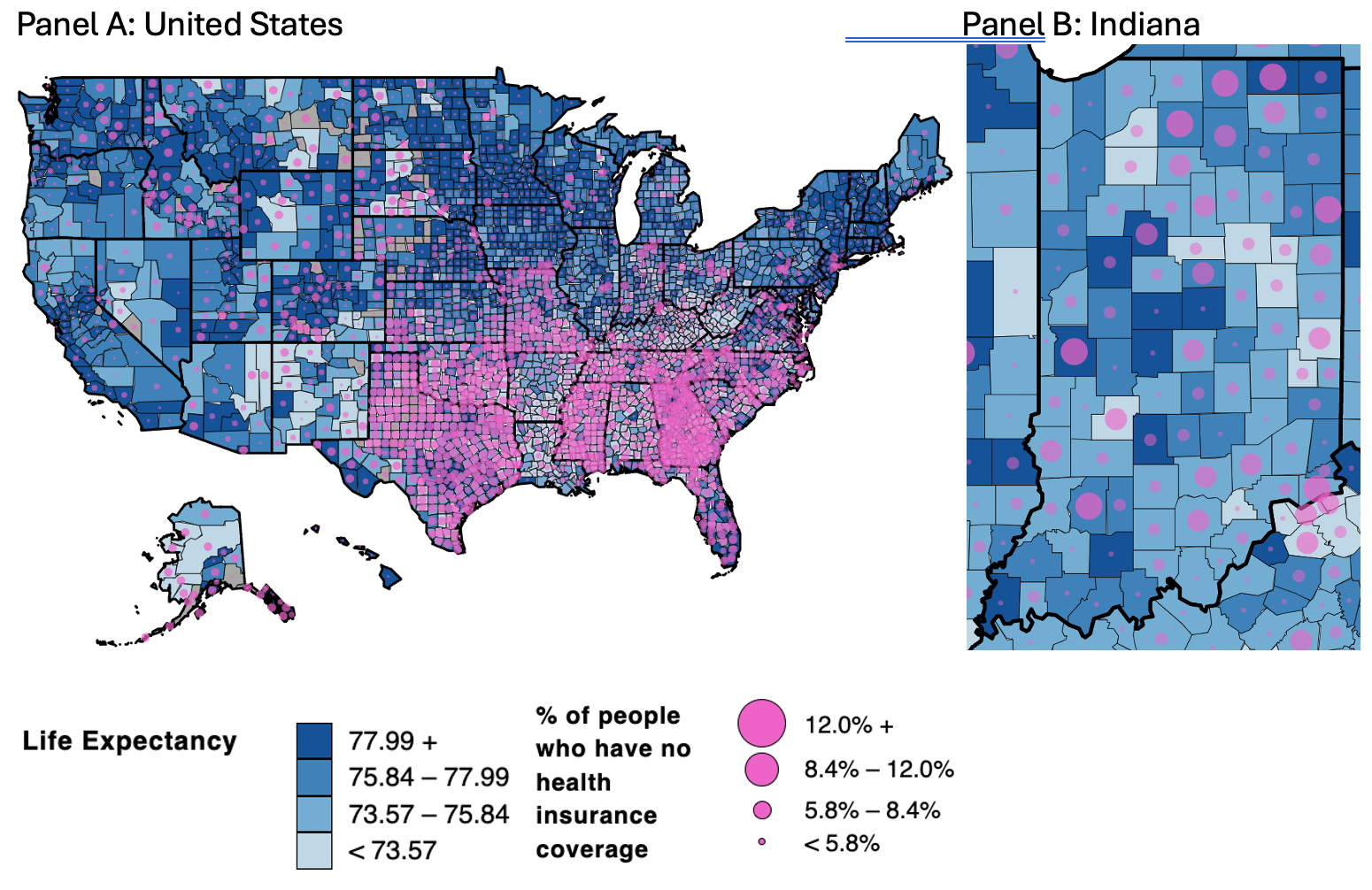
Figure 1. Life Expectancy and Share of Uninsured in the U.S. (Panel A) and Indiana (Panel B)
Note: Life expectancy data in the map comes from the NCHS Mortality File accessed through the Robert Wood Johnson Foundation County Health Rankings. The data refers to the years 2019-2021.[9] Health insurance coverage data is estimated from the U.S. Census Bureau American Community Survey between 2018 and 2022.
The two figures above report the average life expectancy between 2019 and 2021 and the share of the uninsured population between 2019 and 2022 at the county level for the U.S. (Panel A) and Indiana (Panel B). As the legend indicates, the darker the shade of blue, the higher the life expectancy. The percent uninsured is juxtaposed on the life expectancy map by adding pink bubbles in each county, with the size of the bubble increasing with the share of uninsured. Hence, the darker the blue, the higher the life expectancy, and the “pinker” the areas, the higher the percentage of people in the county without health insurance coverage.
Based on this, there are a few takeaways from the maps. First, the highest uninsurance rates are in the South, especially Texas, Oklahoma, Mississippi, Georgia, Florida, Tennessee, and the Carolinas. The health insurance coverage is higher in the West Coast, the Northeast, and, to a lower extent, the Midwest, with some exceptions (especially Missouri) and more within-state variation. Second, life expectancy appears higher in the Northeast, Midwest, and some areas in the West region (particularly in coastal California, Washington State, an agglomerate of counties between Montana, Idaho, Utah, Wyoming, and Colorado). Third, Indiana shows substantial internal heterogeneity in life expectancy. The counties with higher life expectancy are in the Northwest areas of Indianapolis (Boone, Hamilton, and Hendricks), those with the largest academic institutions in the state (Indiana University, Notre Dame, and Purdue University), and Parke Dubois, and Posey counties in Southern Indiana. Fourth, health insurance coverage also varies substantially across counties. The counties characterized by the three lowest uninsurance rates are Hamilton (4.7%), Henry (6.3%), and Delaware (6.9%). Those with the three highest uninsurance rates are Adams (12.5%), Daviess (20%), and LaGrange (25%). There are several Indiana counties characterized by high uninsurance rates and relatively high life expectancy (e.g., LaGrange, Parke, and Carroll) and others with low uninsurance rates and relatively low life expectancy (e.g., Scott, Starke, Pulaski, Howard, Grant, Blackford, Delaware, and Fayette).
These cases motivated me to understand better to what extent there is a relationship between uninsurance rates and life expectancy. To do so, I compared the county-level variation in uninsurance rates to that in life expectancy, and I detected a notable difference between Indiana and the United States. I computed the correlation between uninsurance rates and life expectancy. Correlation is a statistic between -1 and 1 that measures the extent to which two variables are linearly related. In this context, the idea is to determine whether counties characterized by low uninsurance rates are also those characterized by high life expectancy and vice versa.[10] The correlation between these two quantities is -0.44 when considering all U.S. counties, indicating that uninsurance rates are likely accompanied by lower life expectancy despite this relationship being only moderately (rather than strongly) positive. When considering only Indiana counties, the relationship is 0.06, which is positive but very close to zero, implying an essentially null relationship.
While we cannot draw any causal conclusions from these analyses, it does seem like whatever mechanisms are in place across the United States that explain the moderate negative correlation between county-level uninsurance rates and life expectancy appear to be attenuated in Indiana.
In this report, I have identified key differences and similarities in health outcomes between Indiana and the nation, which I hope are useful for local and state policymakers attempting to prioritize their scarce resources in policies related to healthcare and health behavior.
[1] For more information: www.countyhealthrankings.org
[2] Contact the author if you are interested in county-level analyses.
[3] The discussion here is on dimensions for which sharper trends arise and is not comprehensive of all health outcomes in the County Health Rankings. Contact the author if interested in some dimensions left out in this brief.
[4] The Index goes from 0 (worst) to 10 (best).
[5] Easily accessible at: https://ruralhealthmap.norc.org/
[6] The National Opinion Research Center is an independent research institution at the University of Chicago.
[7] Centers for Disease Control and Prevention.
[8] The more technical definition from the CDC is “The average number of years of life remaining to a person at a particular age and based on a given set of age-specific death rates—generally, the mortality conditions existing in the period mentioned.”
[9] More information at: https://www.countyhealthrankings.org/health-data/health-outcomes/length-of-life/life-expectancy?year=2024
[10] If the correlation between two quantities is close to -1, then the two quantities move in opposite directions. The closer to the number -1, the more perfectly linear this relationship is. Positive correlations correspond to relationships where two quantities move in the same direction. If the correlation is close to zero (whether positive or negative), then there is not a clear linear relationship between the two quantities.
![]()
![]()
![]()
![]()
![]()