

Cascade Style Guide - Block Guide
As defined by Hannon Hill, Cascade blocks:
A block is a piece of content that can be inserted (with or without styling) into any page region. Therefore, whenever there is content that is common to many pages or regions, e.g. an “About the Company” section that appears after every press release and newsletter, that content should be put into a block. Doing so allows the appropriate content to appear in many pages while always being updated from one place, making it easy to maintain consistency in that text/markup across many pages. Cascade users can reuse a single block on an unlimited amount of page regions.
Blocks can contain static content, content that does not change unless modified by a user, or dynamic content, content that changes based on updates outside of Cascade CMS or other day-to-day activities.
Why HAVE a Block Guide?
As the name states, blocks are the basic building blocks of Cascade and is one of the most used components. This always up-to-date Cascade Block Guide is a useful reference to help both seasoned and rookie Cascade end users. Reference this Block Guide to better understand and identify all the re-usable content blocks made available from within a Cascade page or news post form's content row section.
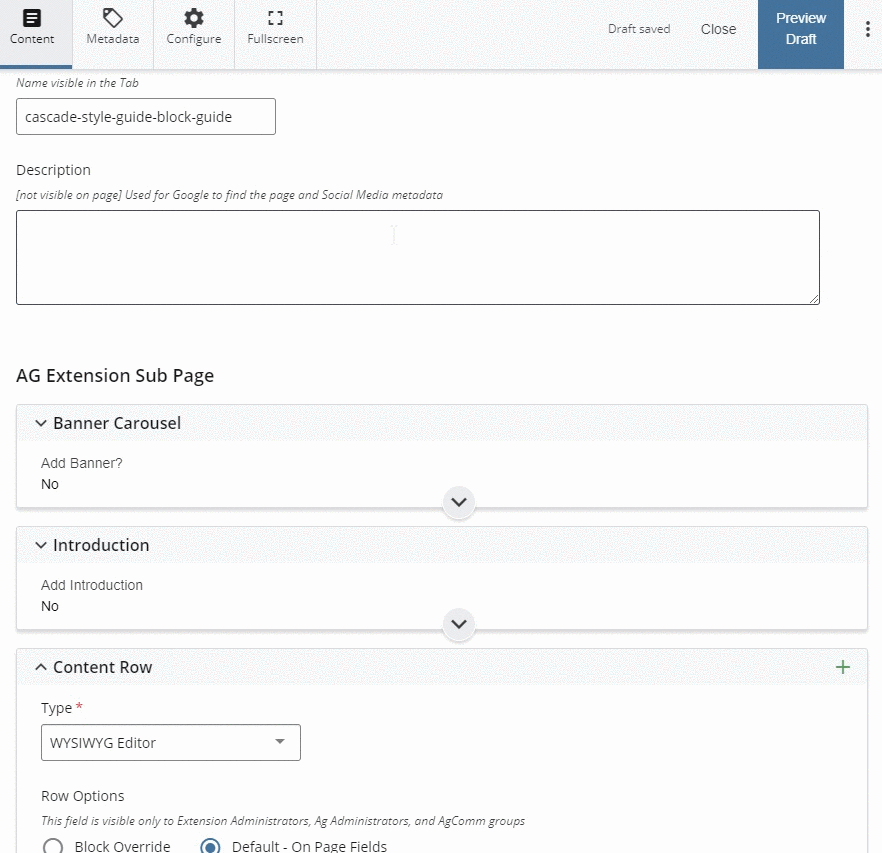 Example: screen capture example of Cascade block location in a form.
 blocks for textual content
what is an accordion block?
An accordion block is an efficient way to present organized content on a page. Accordion drawers contain and collapse content as a content consumer clicks them. This allows a page to contain a lot of content without consuming a lot of vertical space and overwhelming consumers.
The best example of an accordion is the page you are currently viewing and this visual example: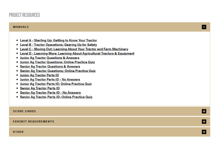
form example and options
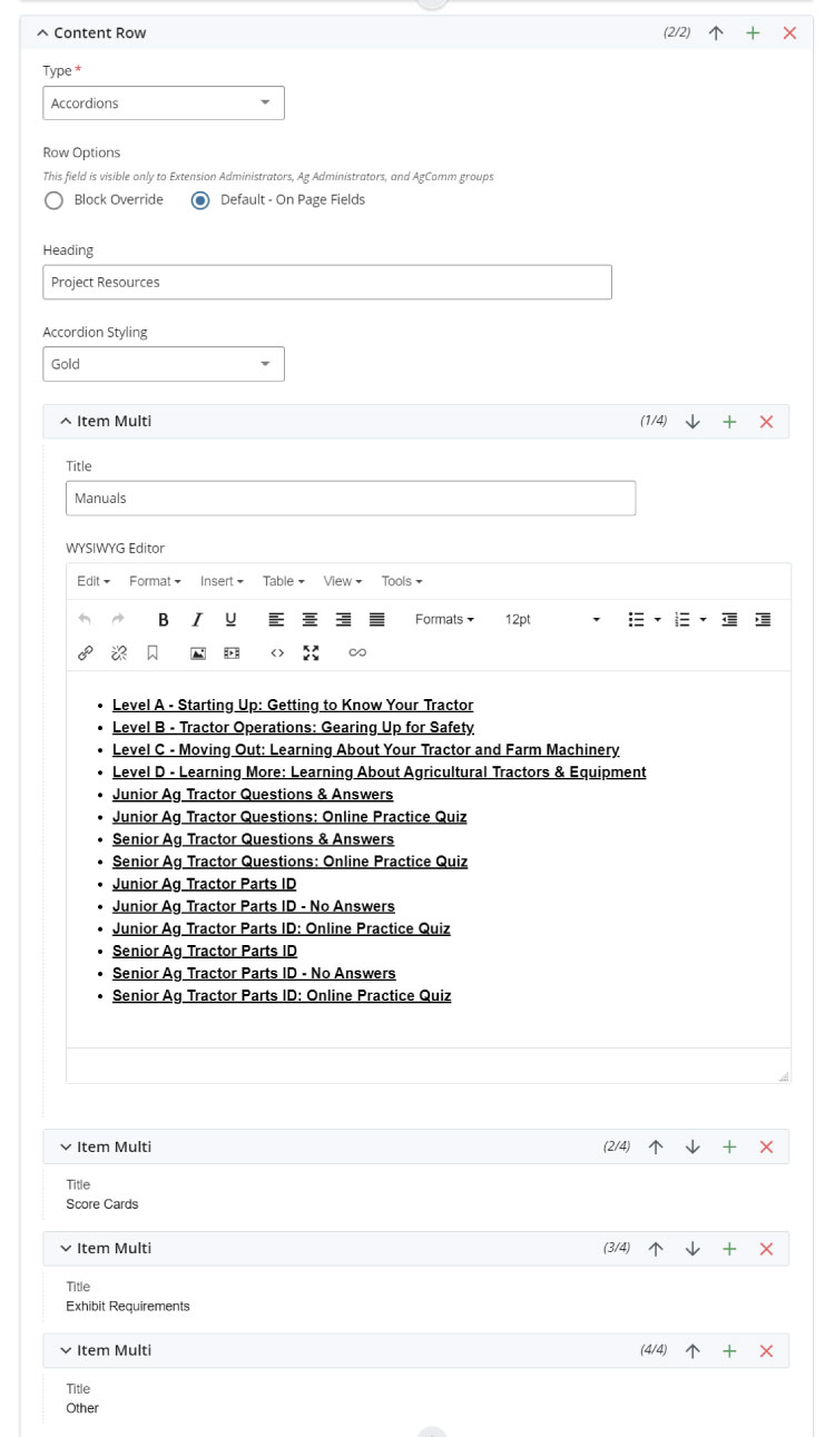
- Accordion heading
- Accordion styling in two colors Purdue Black and Gold
- Unlimited accordion drawers with WYSIWYG editors
FAQ
Q: What is a WYSIWYG editor?
A: Learn more here and learn more about the WYSIWYG editor block.
Q: Is there a maximum limit on the number of accordion drawers I can use?
A: No. However, an excessive amount of drawers could be a content distraction for content consumers. Think less is more. Also, excess drawers may cause browser load and slowness on some users' systems.
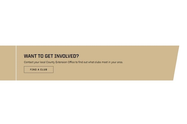
what is a call to action block?
A call to action (CoA) banner block is a smart way to motivate a content consumer to perform an action on your site. In the most basic terms, a link (or button) on a page is a CoA. For example, you may want a student or 4H youth member to sign-up for an event or club after they read about the requirements and benefits on a page.
The best example of a CoA banner block is this visual example:
form EXAMPLE AND options
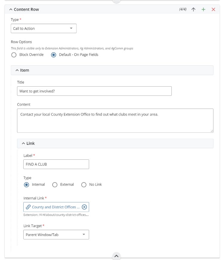
- CoA title
- CoA body text
- CoA link with internal and external URL and browser tab options
FAQ
Q: What is the best use of a call to action (CoA) banner?
A: Use a CoA banner when you have one very important action for content consumers to perform on your site or page. Keep it simple and try not to use multiple CoA blocks per page.
What is a columns block?
The columns block is used to input multiple columns of WYSIWYG text, content call-to-action links (and buttons), images, and embed videos into a 'newspaper column' look. The 'What You See Is What You Get' (WYSIWYG) is the core text editor in Cascade CMS. This block acts as a content editor in the same way word processor applications work. Not only is it a standalone block, but it is also used in many other blocks such as this one.
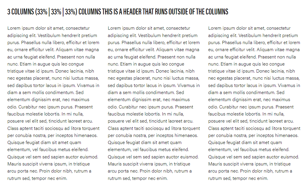
A basic example of a columns block is this example:
form example and options
The columns block options include:
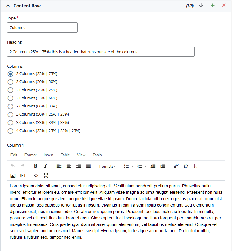
- Section heading
- Column choices (use WYSIWYG block option for single column full body)
- Columns WYSIWYG text editor
FAQ
Q: Can I add the Columns Block to my News Post?
A: Yes, you can utilize the Columns Block within News Posts/Articles. Nevertheless, we suggest limiting its use to a maximum of two columns. This block was introduced to the news to provide Cascade Editors with more flexibility when handling images and text.
Q: Can I see the WYSIWYG in action?
A: Of course! The Cascade end-user introduction training course video covers this.
Q: Do keyboard shortcuts work?
A: Yes. For example, the basic CTRL+C for copy, CTRL+X for cut, and CTRL+V for paste, and all other Windows shortcuts work in the editor. The same works for macOS.
Q: Can I embed a YouTube video?
A: Yes. This option is available via the video menu button. You can also use the fullwidth video and responsive video block options.
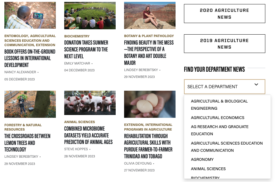
What is a Dropdown block?
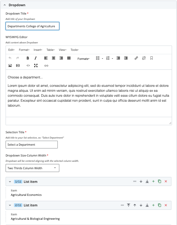
The dropdown block is used to create a list of values/elements that allow you to open links/pages with additional information. Typically, an example is the county selection from the extension main page or the department selection from the news main page.
Creating a dropdown block in Cascade steps:
You have two options for creating a Dropdown block:
-
Directly on the page
-
As a separate, reusable block
Option 1: Create the Dropdown Block Directly on the Page
- Login to Cascade.
- Open the page where you want to add the block,
- Add a new Content Row, select the Dropdown block from the list, and fill in the required information.
Option 2: Create the dropdown block as a separate block
Creating the Dropdown block separately allows you to reuse it across multiple pages, making it a more flexible and maintainable solution.
- Login to Cascade.
- Choose either the Ag or Extension site in the upper left corner.
- Navigate to your /department folder and find a suitable location for your dropdown block.
- Click Add Content > select the Blocks folder > choose Dropdown.
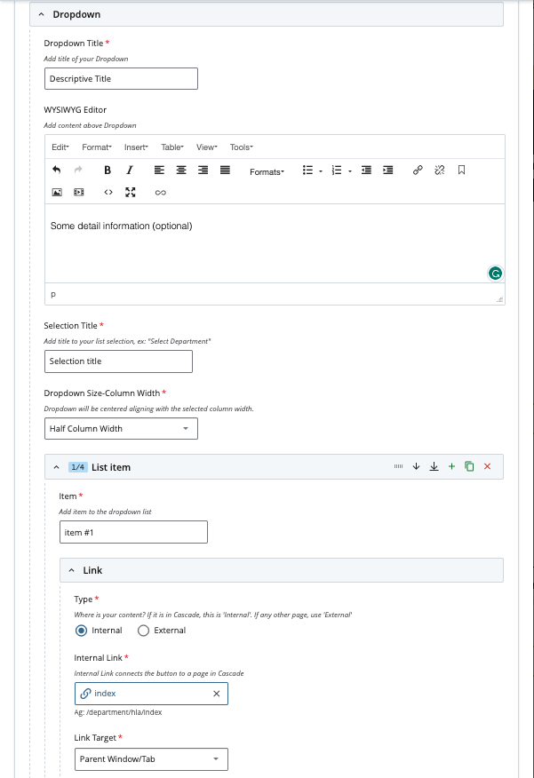
- Fill in the necessary information for the dropdown block, such as the list of values/elements and the corresponding links/pages with additional information, for example:
- Save the dropdown block.
Adding a Reusable Dropdown Block to a Page
-
Open the page where you want to use the block.
-
Add a new Content Row, choose Dropdown – Block from the list, and select your previously created block.
You can edit your block at any time. Remember to save your changes, test the block, and publish it when you're ready.
A basic example of the dropdown block
EXAMPLE FORM AND OPTIONS
The Dropdown block options include:
FAQ
Q: Can I add the Dropdown on several pages?
A: Yes, you can utilize the Dropdown Block within the pages that you need. First, create your block, then add it to your page using the block override option.
Q: Do I have to always have to select a width?
A: No. If you don't select the width, it will set a full width as the default.
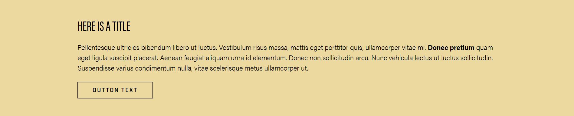
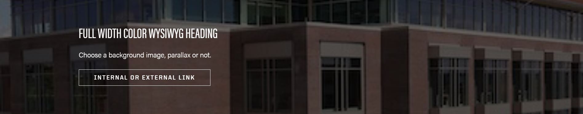
What is a Full Width Color WYSIWYG block?
The Full Width Color WYSIWYG block is used similarly to the regular WYSIWYG block, except this block is full-width (spans from the left edge to the right edge of your screen) and allows you change the background color.
A basic example of the Full Width Color WYSIWYG block is this example:
form example and options
The Full Width Color WYSIWYG block options include:
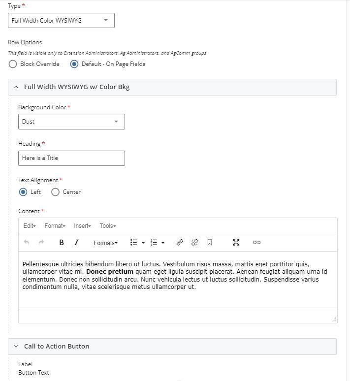
- Background Type Selector
- Background Color
- Color
- Background Photo
- Background photo chooser
- Parallax
- Heading
- Text Alignment
- Content
FAQ
Q: Can I choose any color I want for the background?
A: No, we have included 4 in-brand color options. These were specifically chosen as they are all ADA compliant.
Q: Can I have more than one of these blocks on my page?
A: Of course!
Q: Do I have to have a button/link?
A: No, when you choose this block, the default is set to have no link/button. You can choose to turn that on if you wish!
what is a HEADSHOTS block?
A headshots block is used to display a person's contact info and 'headshot' photo on a page.
The best example of a headshots block is this visual example:
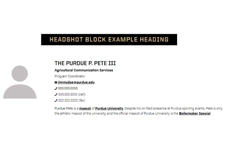
form EXAMPLE and options
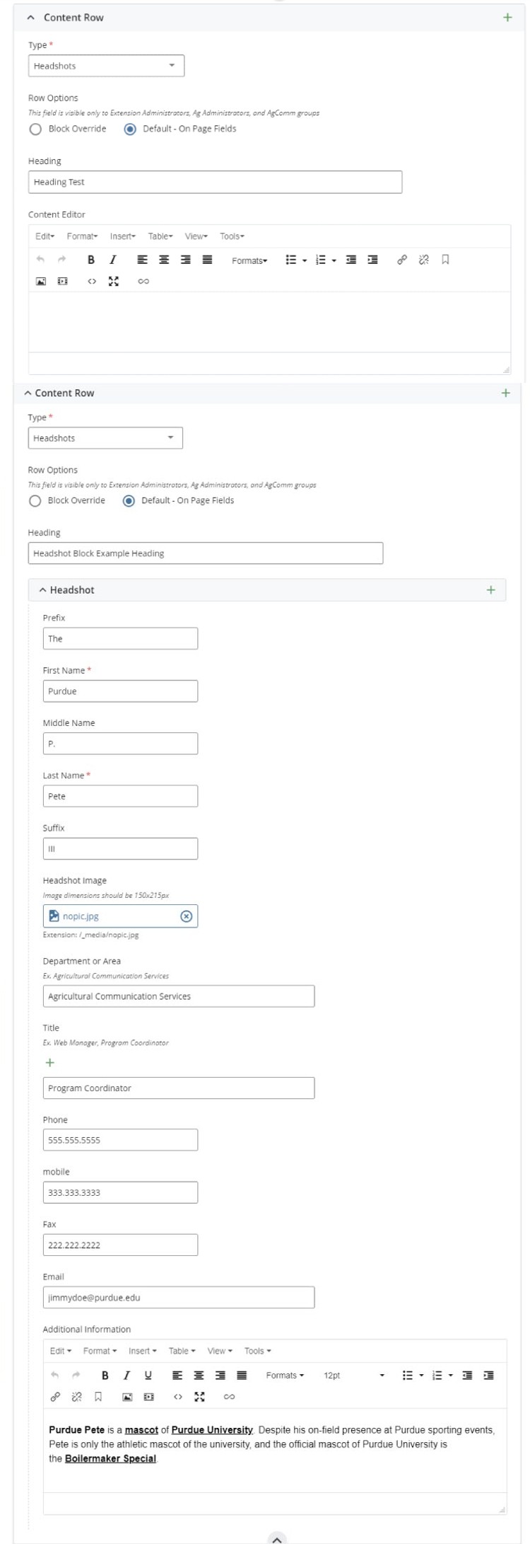
- section heading
- section WYSIWYG content editor
- personal information to include name, photo upload, department, area of expertise, phone, email, etc. and WYSIWYG editor to add bio or additional information
FAQ
Q: Are there other ways to embed user and group contact information on a Cascade page?
A: No. However, The College's and each department's directory can be linked on any page or via any call to action option. Learn more about the directory at AGIT's directory guide.
Q: How many people can I add?
A: There is no limit. However, a long page of headshots is more difficult to maintain and edit. Consider linking to The College Of Agriculture's Faculty And Staff Directory as a simpler way of sharing contact information.
Q: Why are my headshot images displaying as different shapes and sizes?
A: All headshot images should be resized to be 150x215 pixels as noted on the block form. Learn more about working with images here.
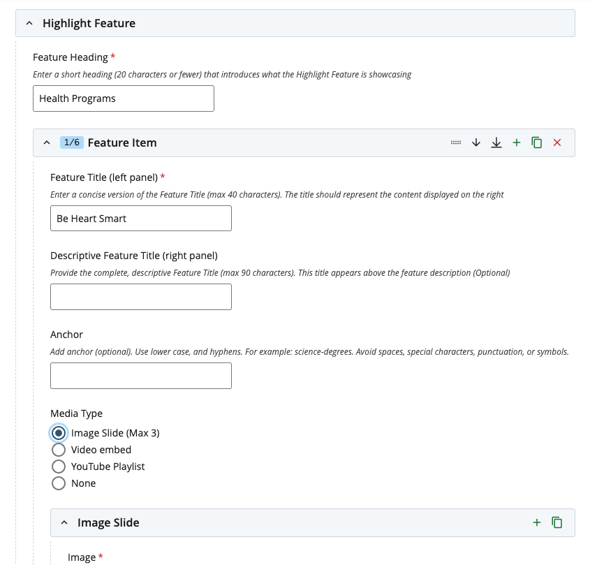
The Highlight Feature Block is an interactive component that displays grouped content in one place, reducing page scrolling and improving navigation. It supports multiple media types (images, videos, video playlists, and text) and adapts to an accordion view on mobile. The Highlight Feature block is intended to present program features, research highlights or multimedia content in a consistent format. To maintain its intended purpose and clarity, only one Highlight Feature block is permitted per page.
Functionality
- Displays a list of selectable options on the left panel, with corresponding content shown on the right.
- When an option is selected, the right-side content dynamically updates to match.
- On mobile devices, the layout automatically adapts to an accordion format for accessibility and readability.
Content Layout Options (Right Panel)
The right content area supports four layout variations:
- Image Slide (carousel) or Single Image: Up to 3 images, short text, and optional link.
- YouTube Video: A single embedded video, short text, and optional link.
- YouTube Video Playlist: A curated list of videos, short text, and an optional link.
- Text Only: Short text with an optional link.
This block also supports internal and external anchors for in-page navigation or linking from other pages.
Fields Available
- Feature Heading
- Introduces the Highlight Feature content. Each block must include a clear heading.
- Feature Title
- A short, concise version of the title that best describes the feature.
- Descriptive Feature Title
- A longer, more descriptive version of the title (useful for longer names).
- If you don't have a descriptive feature title, the feature title will display by default on the right panel at the top of your content.
- Anchor
- Creates a reference point on a page that allows users to jump directly to a section, either from links on the same page or from other pages.
- Media Type
- Choose from: Image Slide, YouTube Video, YouTube Video List, or None. Note: If you see black bars at the top and bottom of your video, it means the video isn’t in the standard 16:9 widescreen format (common for most modern videos). You can add some padding by checking a box, which adjusts the display so the video appears closer to 16:9.
-
- For images, use a 3:2 aspect ratio (e.g., 2400x1600px or 1200x800px). Refer to the Cascade user guide for image best practices.
- Description
- Add a short description of the highlighted element.
- Link
- Add a link for more details or related content. The link will display as a button.
Use Cases
The Highlight Feature Block works well for organizing:
- Program features or benefits
- Curriculum Highlights
- Interactive tutorials
- Research highlights
- Multimedia showcases
FAQ
Q: Can I add more than one Highlight Feature Block to a page?
A: No. Only one Highlight Feature Block is allowed per page.
Q: Can a feature item have just one image?
A: Yes. A feature item can include one, two, or up to three images.
Q: What if I don’t have a descriptive feature title?
A: A descriptive feature title is optional. If you don’t have one, the standard feature title will display by default in the right panel at the top of your content.
Q: Can I include a lot of text in the right panel for my feature item?
A: No. Use the right panel for a brief description only. If you have more detailed content, place it on a separate page and link to it from the feature item.
Q: Can the images in the same feature item have different dimensions?
A: Images may vary in dimensions, but they should maintain the same aspect ratio to prevent layout shifts during transitions. A 3:2 aspect ratio is recommended (e.g., 2400×1600px or 1200×800px). For additional details, refer to the Cascade User Guide on image best practices.
What is a QUOTE block?
Use the quote block to stylize a textual quote. For example, a historic quote or a department head's speech key point.
The best examples of a quote block are these two visual examples:
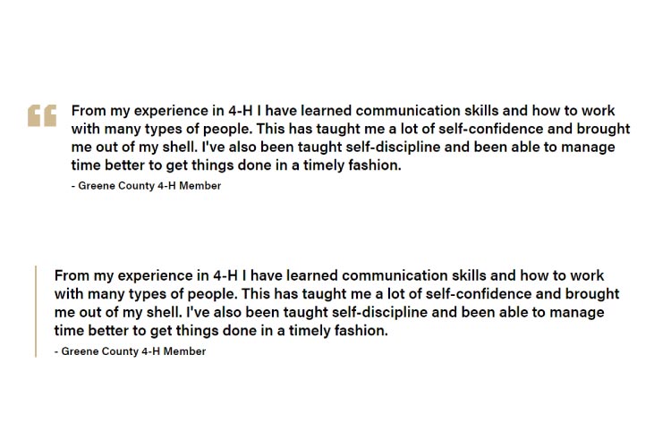
form example and options
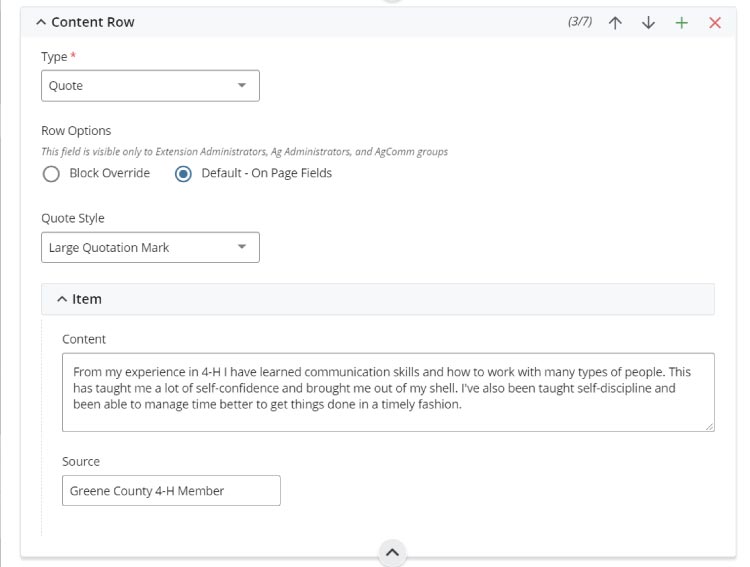
- Quote styles with two visual options (see examples above)
- Content for quote text
- Source for quote author, date, etc.
FAQ
Q: What is the difference in quote block styles?
A: One has a large Purdue gold quotation mark and the other replaces this with a gold vertical bar left of the quote block.
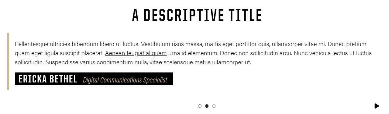
What is a simple testimonials block?
The simple testimonial block is used to add testimonials or quotes with or without images in a slider.
A basic example of the Simple Testimonials block is this example (with & without an image):
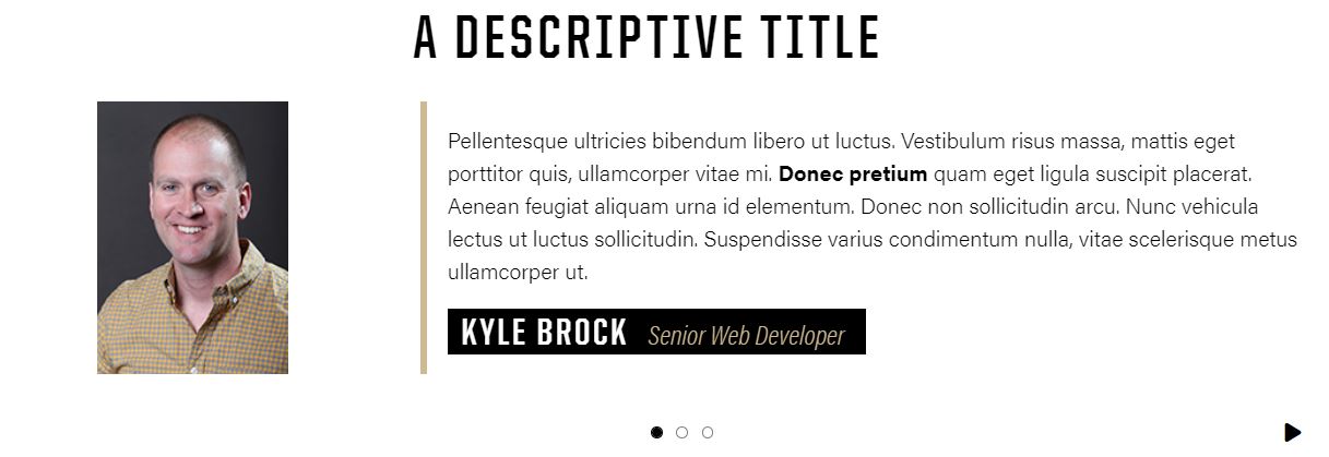
form example and options
The simple testimonial block options include:
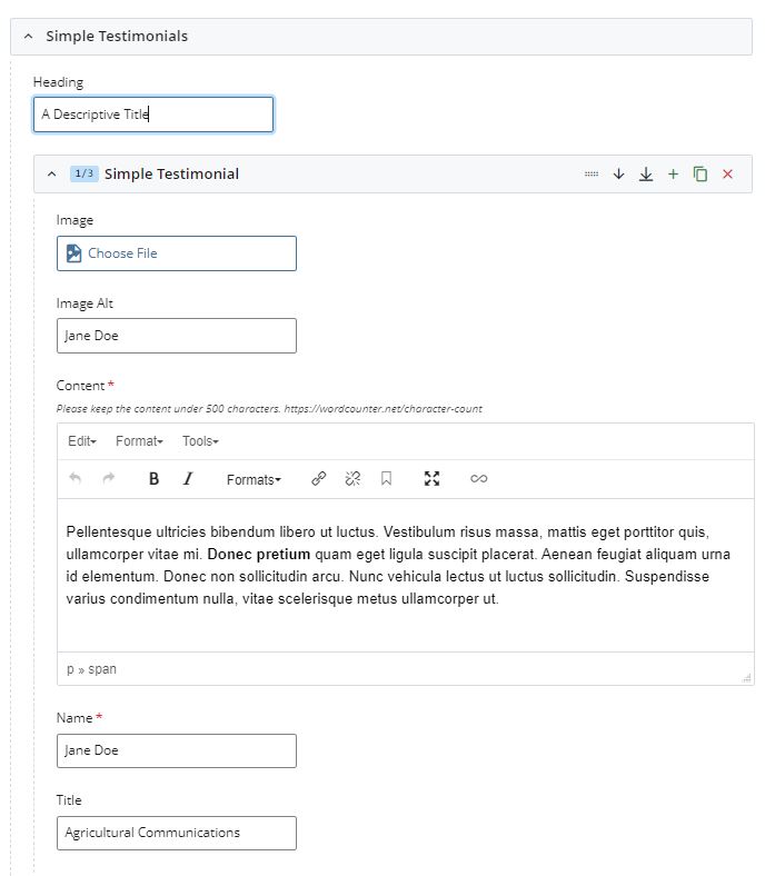
- Section heading
- Optional Image + Alt Text
- Simple Testimonials WYSIWYG text editor
- Name
- Title
FAQ
Q: Do I have to add an image?
A: No, you do not have to add an image to your Simple Testimonial block slides. You can have all of the slides with images, all without, or a mixture of both.
Q: Is there a maximum amount of testimonials I can add?
A: There is no maximum number of testimonials. You must add at least one.
Q: Can I add extra code or styling?
A: Please refrain from using code or adding any kind of styling or formatting other than bold, italic, or adding a link. This could break the slider and cause it to break on your page. If you are looking for something specific, please reach out to us!
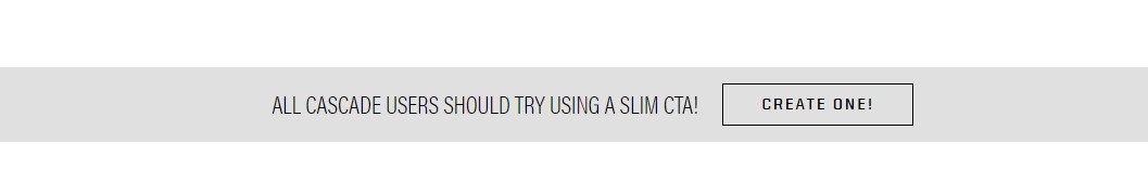
What is a slim cta block?
A slim cta (call to action) block is a quick, easy and colorful way to add short and simple actions you want users to take on a page.
A basic example of the Slim cta block is this example:
form example and options
The slim cta block options include:
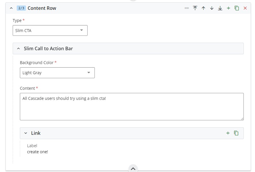
- Background color selection (approved Purdue brand colors)
- Textual content section
- Call to action button link (internal, external or none)
FAQ
Q: How many Slim CTAs can I use per page?
A: While there’s no strict limit on the number of Slim CTAs you can include, it's a good idea to use them thoughtfully. You want to keep the experience enjoyable for your users without overwhelming them.
what is a TABLE block?
A table block is an accessible and compliant way to present table row content on a page. Tables can list multiple rows of text content while supporting keyboard navigation and screen readers in various Purdue University-approved styles.
The best example of a table block is this visual example: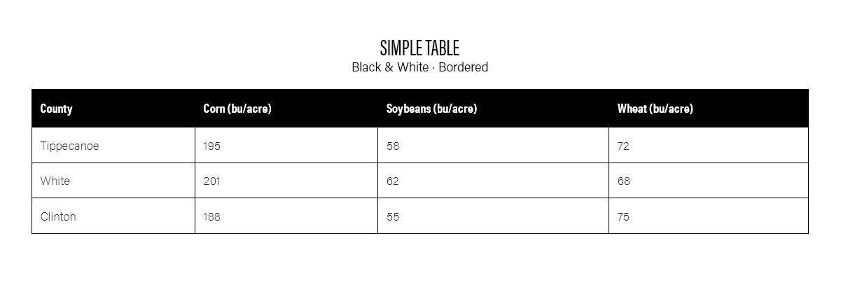
form example and options
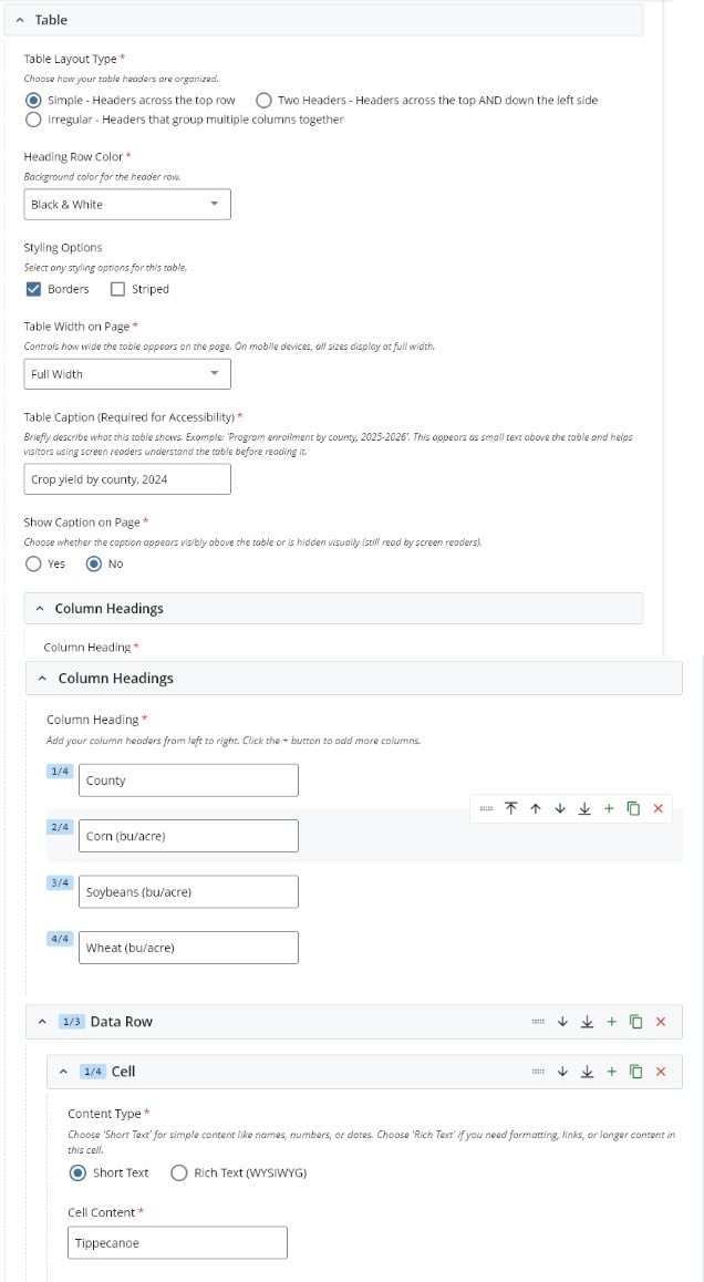
- Table Layout Types:
- Heading Row Colors:
- Black & White
- Light Gray
- Boilermaker Gold
- Dust
- Styling Options of solid Borders, Striped, or none
- Table Width can be Full, Half, Three-Quarter, or page content width
- Table Caption (Required for Accessibility)
- Show Caption on Page toggle
- Column Headings
- Data Row(s)
Note: To quickly build your rows of cell data, fill out the initial row to match your header row content, then use the Cascade Copy button for each additional Data Row needed, then go back and edit the cell content for each row.
FAQ
Q: Why should I use this block option over a table embed from a third-party tool like Airtable or Microsoft Excel?
A: Embedded tables from third‑party table embeds aren’t fully accessible. Because they run inside iframes and are controlled by external platforms, they can have poor screen‑reader support, limited keyboard navigation, and unclear focus behavior. These tools recommend that you use their built-in accessibility tools and directly link them to access your tables to ensure a compliant experience for users.
what is an Tabs block?
A tabs block is an efficient way to present organized content on a page. Tabs are a great way to show content on demand when a tab is clicked. Tabs can condense multiple pieces of content into just one page with minimal page space needed. This allows a page to contain a lot of content without consuming a lot of space.
The best example of a tabs block is this visual example: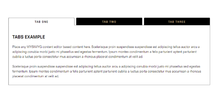
form example and options
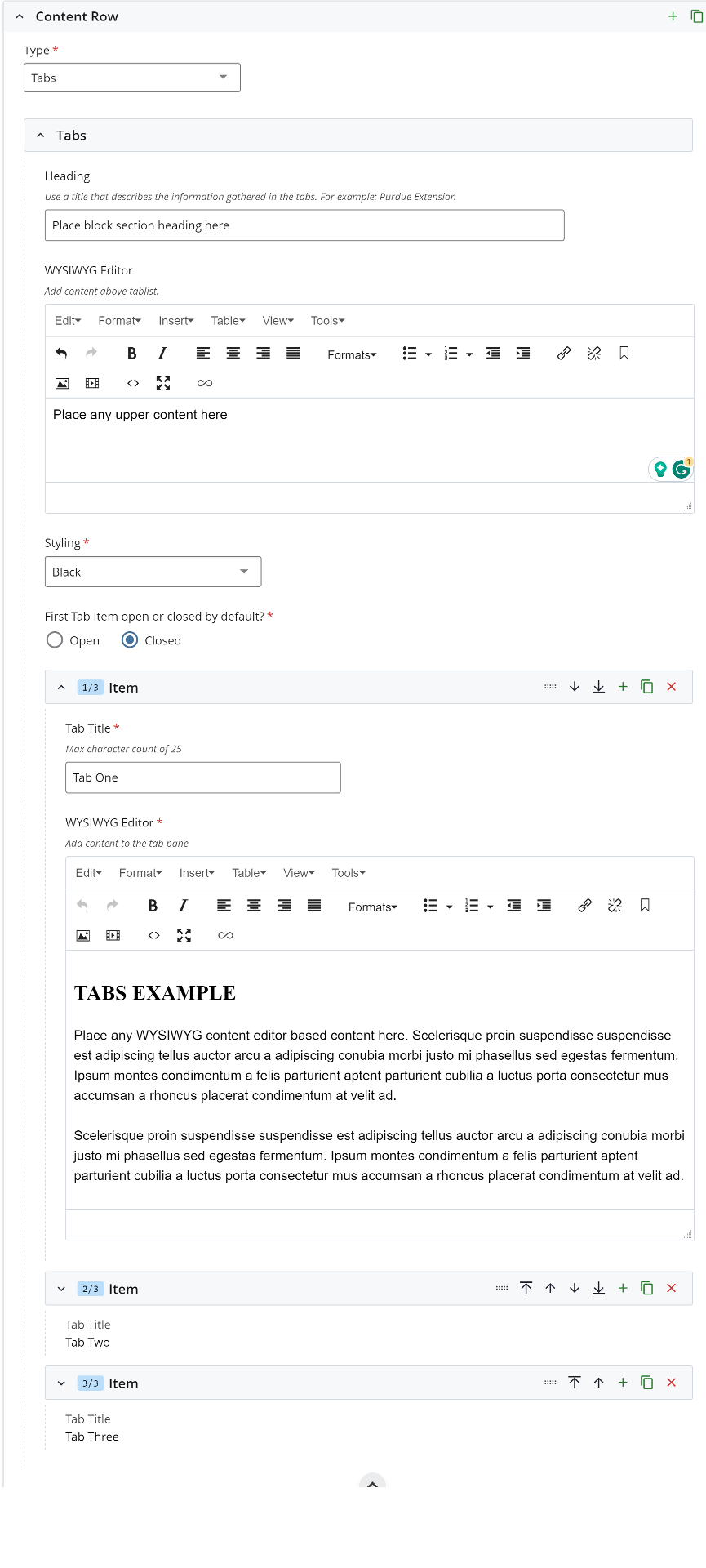
- Tabs section heading
- Accordion styling in two colors Purdue Black and Gold
- Unlimited tabs with WYSIWYG editors (recommend a limited amount of tabs for content consumers)
FAQ
Q: What is a WYSIWYG editor?
A: Learn more here and learn more about the WYSIWYG editor block.
Q: Is there a maximum limit on the number of tabs I can use?
A: 8 tabs is the maximum. An excessive amount of tabs could be a content distraction for content consumers. Think less is more when using tabs to no overwhelm users.
What is a WYSIWYG editor block?
The 'What You See Is What You Get' (WYSIWYG) block is the core text editor in Cascade CMS. This block acts as a content editor in the same way word processor applications work. Not only is it a standalone block, but it also used in many other blocks. This block is used to input text, apply text styling, add content links (and buttons), add images, embed videos, and is used to format this content on a page.
A basic example of a WYSIWYG block is this example:
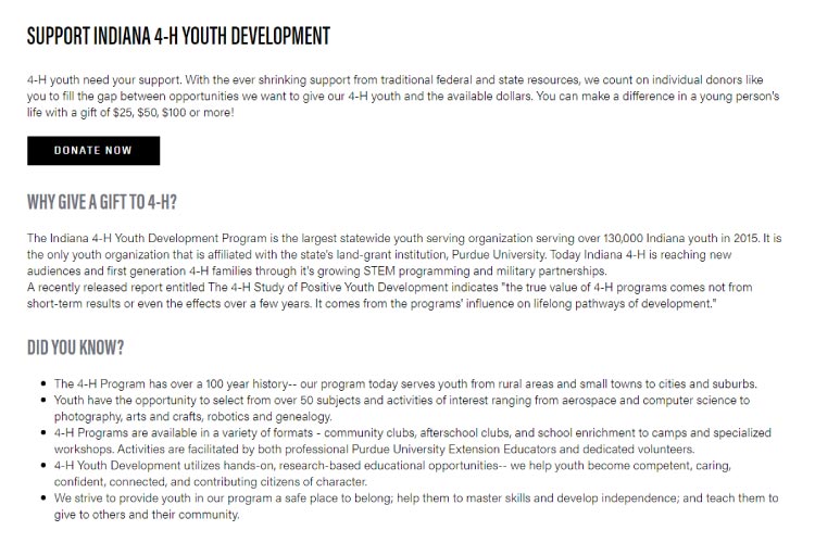
form example and options
The WYSIWYG options include:
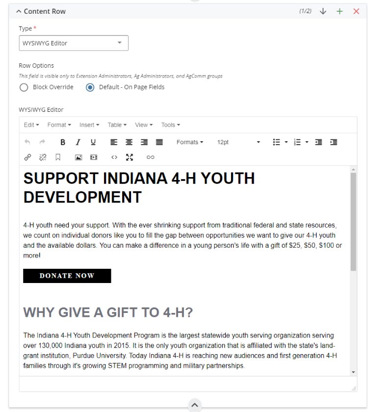
- Undo/Redo
- Bold and italic text styles
- Text image alignment
- Format(s) any highlighted text to create headings, paragraphs, text quotes, and button styles
- Bulleted and numbered lists
- Insert, edit, remove URL links for any highlighted content
- Insert edit an image
- Insert, embed, or edit a video
- Source code editor to edit and create on-page HTML/CSS/SCRIPT code and embed code as needed
Note: You can mouse hover over the WYSIWYG menu buttons to identify what each button is named.
Adding social media icons
You can also add social media icons in the WYSIWYG editor. To do this, select the WYSIWYG block on your Cascade page, and while working in the editor, insert the desired icons.
- Select the link icon in the WYSIWYG menu,
- Add the social link as an external link,
- Remove the auto-populated 'text to display',
- Add the alternate title 'Title',
- Select the target as a New Window,
- Choose the social icon from the ‘Styling’ section: Custom Formats dropdown list.
FAQ
Q: Can I see the WYSIWYG in action?
A: Of course! The Cascade end user introduction training course video covers this.
Q: Where can I learn more about Cascade WYSIWYG options and word styles?
A: Visit our Cascade Style Guide Overview resource.
Q: Do keyboard shortcuts work?
A: Yes. For example, the basic CTRL+C for copy, CTRL+X for cut, and CTRL+V for paste, and all others Windows shortcuts work in the editor. The same works for macOS.
Q: Can I embed a YouTube video?
A: Yes. This option is available via the video menu button. You can also use the fullwidth video and responsive video block options.
Q: Can I embed Qualtrics forms on my Cascade pages?
A: Yes. Learn how here.
blocks for news article posts
What is a FEATUREd STORY block?
The featured story block allows a single story to be created manually or filtered and displayed on a page from a news site.
An example of a featured story block on a page:
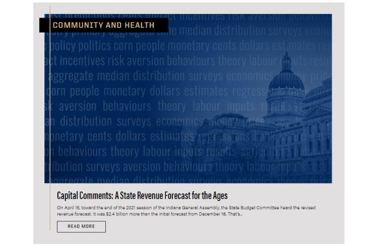
form EXAMPLES and options
The featured story block requires a two-step approach of having both an on-page block and an additional event site tag filter block. There is also an option to create a manual link to any asset.
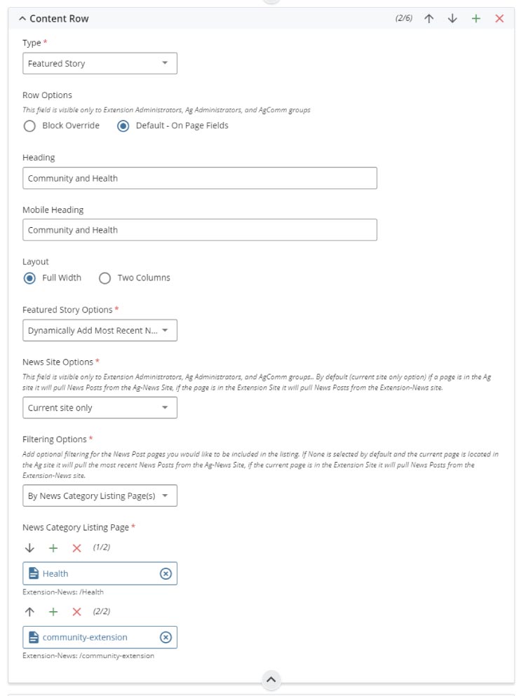
The featured story block form is used to:
- create desktop and optional mobile headings
- news article sort options:
- dynamically add the most recent news article post
- manually select a news article post
- manually create and link any internal or external asset
- news site source options of CoA, Extension sites or both
- filtering options by category listing page or tags
Note: The tags form option at the bottom of all forms is for internal CMS tagging and not part of the events listing block form settings.
FAQ
Q: What block can I use for multiple news articles?
A: There are multiple block choices to include the featured stories, news articles, top stories, and two panel stories blocks.
Q: Is there a list of filters to reference?
A: Yes there is!
Q: What is a category listing page? Where are they located?
A: A category listing page is a pre-built event or news metadata asset that groups all similarly tagged items onto a searchable index page. These category listing pages are located in the root directory of a news or event site.
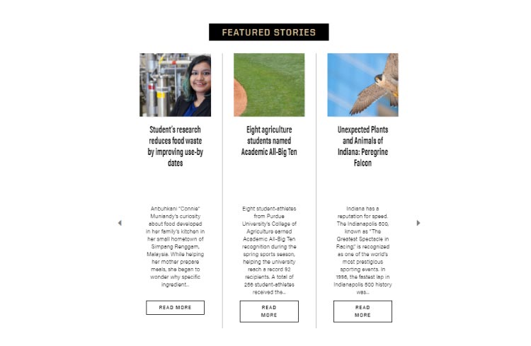
What is a Featured STORIES block?
The featured stories block allows multiple news articles (at least three are recommended) to be created manually or filtered and displayed on a page from a news site.
An example of a featured stories block on a page:
form EXAMPLES and options
The featured stories block requires a two-step approach of having both an on-page block and an additional event site tag filter block. There is also an option to create a manual link to any asset.
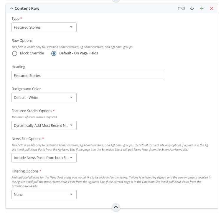
The featured stories block form is used to:
- section heading
- background-color choices
- news article sort options:
- dynamically add the most recent news article post
- manually select a news article post
- manually create and link any internal or external asset
- news site source options of CoA, Extension sites or both
- filtering options by category listing page or tags
Note: The tags form option at the bottom of all forms is for internal CMS tagging and not part of the events listing block form settings.
FAQ
Q: What blocks can I use for multiple news articles?
A: There are multiple block choices to include this block, news articles, top stories, and the two panel stories blocks.
Q: Is there a list of filters to reference?
A: Yes there is!
Q: What is a category listing page? Where are they located?
A: A category listing page is a pre-built event or news metadata asset that groups all similarly tagged items onto a searchable index page. These category listing pages are located in the root directory of a news or event site.
What is a NEWS ARTICLES block?
The news articles block allows multiple news articles to be created manually or filtered and displayed on a page from a news site.
An example of a news articles block on a page:
form EXAMPLES and options
The news articles block requires a two-step approach of having both an on-page block and an additional event site tag filter block. There is also an option to create a manual link to any asset.

The news articles block form is used to:
- section heading
- news article sort options:
- dynamically add the most recent news article post
- manually select a news article post
- manually create and link any internal or external asset
- news site source options of CoA, Extension sites or both
- filtering options by category listing page or tags
Note: The tags form option at the bottom of all forms is for internal CMS tagging and not part of the events listing block form settings.
FAQ
Q: What blocks can I use for multiple news articles?
A: There are multiple block choices to include this block, featured stories, top stories, and the two panel stories blocks.
Q: Is there a list of filters to reference?
A: Yes there is!
Q: What is a category listing page? Where are they located?
A: A category listing page is a pre-built event or news metadata asset that groups all similarly tagged items onto a searchable index page. These category listing pages are located in the root directory of a news or event site.
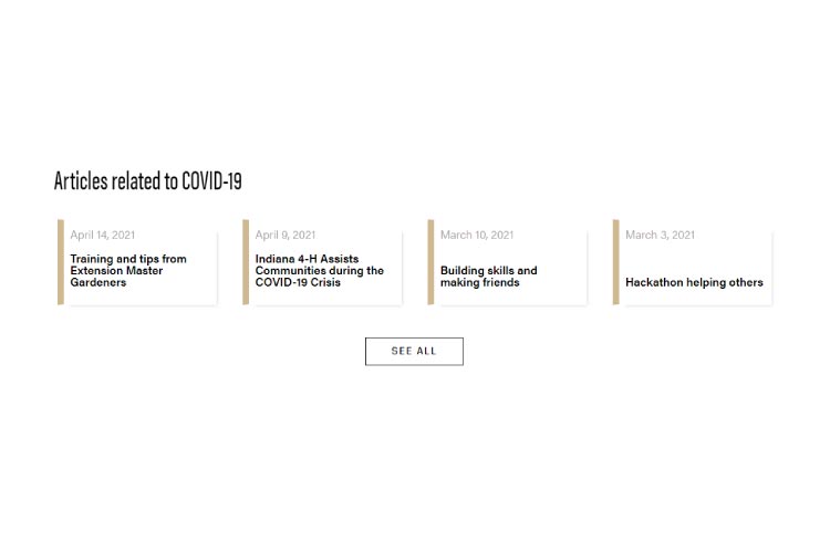
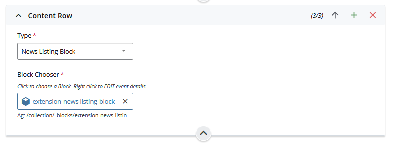
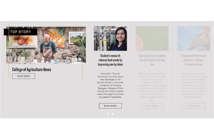
What is a NEWS listing block?
The news listing block allows multiple news articles to be created manually or filtered and displayed on a page from a news site.
An example of a news listing block on a page:
form EXAMPLES and options
The news listing block requires a two-step approach of having both an on-page block and an additional news listing filter block. This block can be added by choosing Add Content > User Blocks.
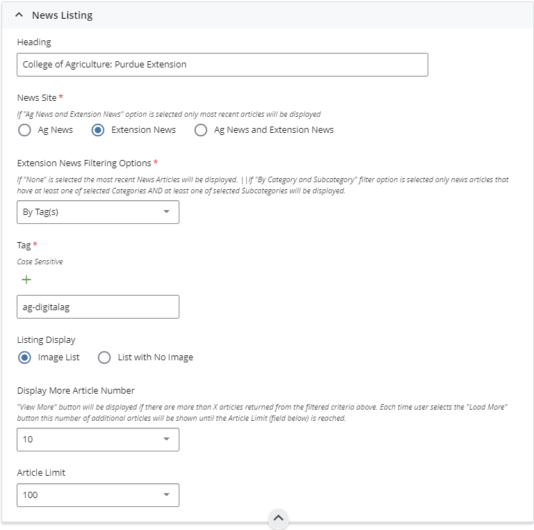
The news listing block form is used to:
- section heading
- news site options:
- Ag News site article filtering
- Extension News site article filtering
- Most recent Ag and Extension News (combines both Cascade News sites' articles into one feed)
- filtering options:
- None (most recent articles)
- By news category
- By news subcategory
- By category and subcategory
- By tags
- Listing display options of allowing article images displayed or a list with no images just text.
- Article display limits for the number of articles listed on page load and the number of articles loaded when the view more call to action button is selected.
Note: The tags form option at the bottom of all forms is for internal CMS tagging and not part of the events listing block form settings.
FAQ
Q: What blocks can I use for multiple news articles?
A: There are multiple block choices to include this block, featured stories, top stories, and the two panel stories blocks.
Q: Is there a list of filters to reference?
A: Yes there is!
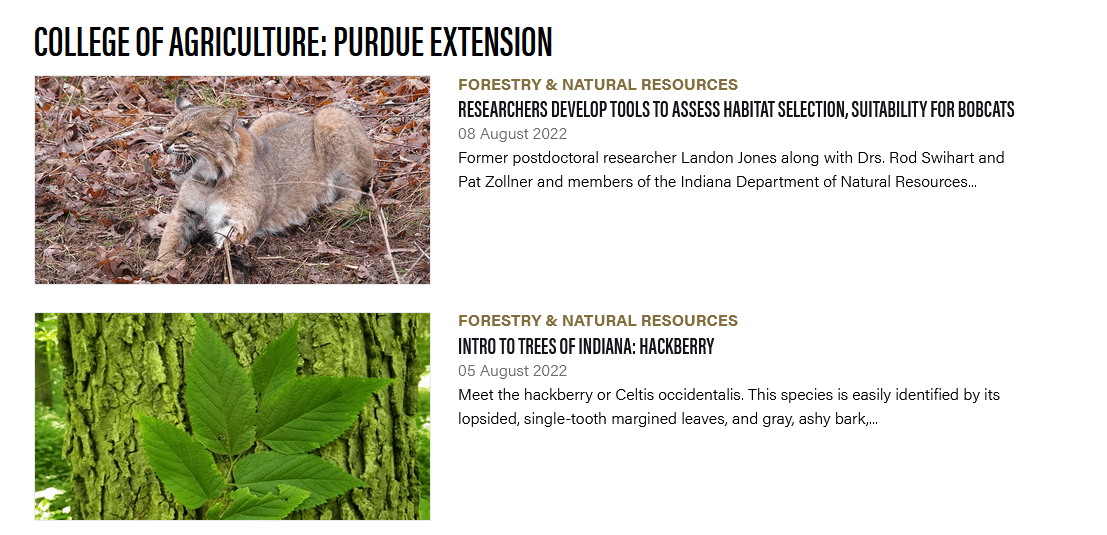
What is a TOP STORIES block?
The top stories block allows multiple news articles to be filtered and displayed on a page from a news site.
An example of a top stories block on a page:
form EXAMPLES and options
The top stories block requires a category listing page connection to function (see FAQ below).
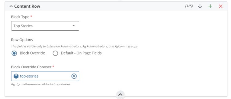
The top stories block form is used to:
- selecting a pre-built category listing page (see FAQ below)
Note: The tags form option at the bottom of all forms is for internal CMS tagging and not part of the events listing block form settings.
FAQ
Q: What blocks can I use for multiple news articles?
A: There are multiple block choices to include this block, news articles, featured stories, and the two panel stories blocks.
Q: Is there a list of filters to reference?
A: Yes there is!
Q: What is a category listing page? Where are they located?
A: A category listing page is a pre-built event or news metadata asset that groups all similarly tagged items onto a searchable index page. These category listing pages are located in the root directory of a news or event site.
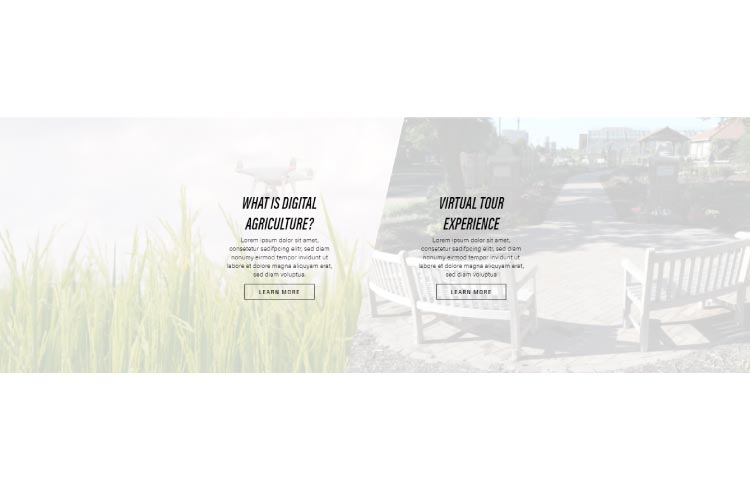
What is a two panel stories block?
The two panel stories block can link to any internal site asset or external source to be displayed on a page (looks best when used at the footer of a page).
An example of a two panel stories block on a page:
form EXAMPLES and options
The two panel stories block is made using a left-and-right panel.
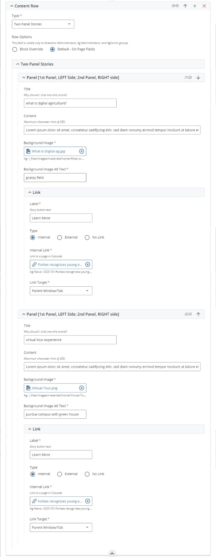
The two panel stories block form is used to create:
- the panel title
- 250 characters of story lead-in content to grab a content consumer's attention
- background image (light filter is added by CSS code) and alt text
- call to action button link with internal and external options
Note: The tags form option at the bottom of all forms is for internal CMS tagging and not part of the events listing block form settings.
FAQ
Q: What blocks can I use for multiple news articles?
A: There are multiple block choices to include this block, news articles, featured stories, and the top stories blocks.
Q: What is a category listing page? Where are they located?
A: A category listing page is a pre-built event or news metadata asset that groups all similarly tagged items onto a searchable index page. These category listing pages are located in the root directory of a news or event site.
block for events
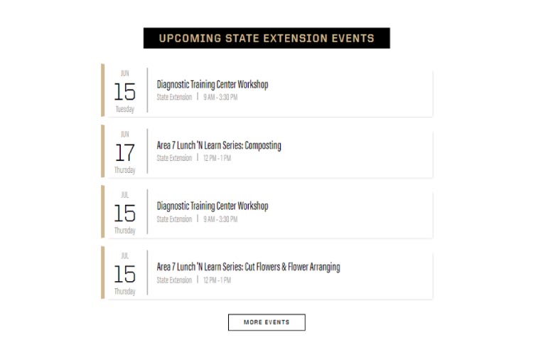
What is aN EVENTS LISTING block?
Cascade sites are made of three independent but shareable sites:
The Ag sites are:
- Ag site for CoA based pages
- Ag-Events site for CoA based calendar events
- Ag-News site for news article posts
The Extension sites are:
- Extension site for CoA based pages
- Extension-Events site for CoA based calendar events
- Extension -News site for news article posts
The events listing block allows created event site events to be tagged, sorted, and displayed on a page.
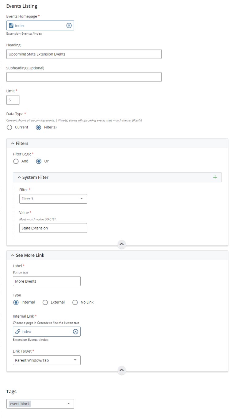
An example of an events listing block on a site page:
form EXAMPLES and options
The events listing block requires a two-step approach of having both an on-page block and an additional event site tag filter block.
The on-page block's form is very simple and is only used to locate the event site's filter block:
The event site's filter block form is used to:
- identify an event's homepage for event data access
- add a block heading and sub-heading
- limit the number of events listed on-page
- set a current filter to simply display all newly created site events in date order
- set AND/OR logic filters:
AND logic
To identify events that meet all criteria within a set of filters, use AND logic. For example, to filter all events tagged 'Agriculture' AND 'State Fair' on-page via the events listing block.
OR logic
To identify events that meet at least one criteria within a set of filters, use OR logic. For example, to filter any events tagged 'Agriculture' OR 'State Fair' on-page via the events listing block. - add a 'see more' call to action link button with internal and external link options
Note: The tags form option at the bottom of all forms is for internal CMS tagging and not part of the events listing block form settings.
FAQ
Q: Do I need to use an events listing block?
A: Not always. Events can also be viewed from an event site's index page(s). An event index page also displays:
- adjustable on-page content/tag filters content consumers can adjust
- RSS and calendar sharing options
- a full list of similar tagged events
For example, a direct url link could be used to direct content consumers to a news index page via hyperlink text or a call to action button or block. This example would bypass the need for an on page events listing block.
Q: Can more than one events listing block be placed on a page?
A: No.
Q: Is there a list of filters to reference?
A: Yes there is!
Q: What is an event block? Where are they located?
A: An event block is a pre-built data definition that is located within an event site's /_files folder. These are read-only files built and placed by your web team and are based on pre-defined search criteria. Contact the web team if you think a filter solution has not been addressed by the pre-built blocks.
blocks for media
what is the embed block?
The Embed block allows you to embed media directly into your Cascade page. Currently, this block supports Spotify podcasts and Qualtrics forms/surveys.To add an Embed block to your page:
- Go to your Cascade page and add a new block.
- From the dropdown menu, select Embed.
- Select the type of embed: Podcast or Survey from the Media Block Layout.
Configuring the podcast Embed
Each item in the block is organized in a row that contains the embedded podcast player and an accordion for the transcript for the podcast (you may also include a link to the transcript instead).
Once the block is added, follow these steps:
1. Add a Heading and Optional Description
You may include a heading and, if needed, a short description. A dedicated text area will be available for this information.
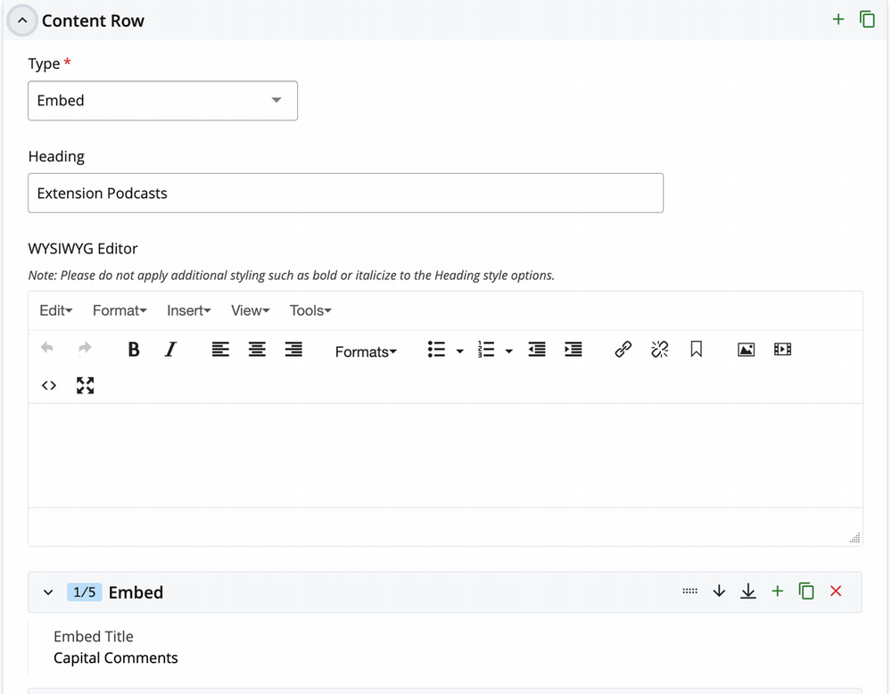
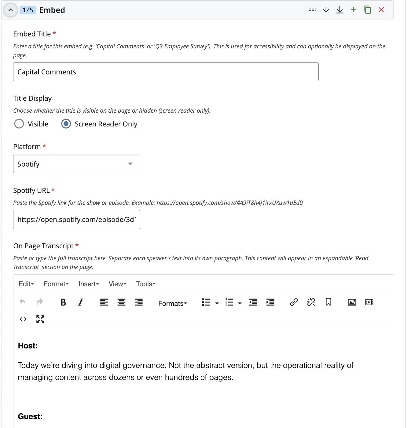
2. Add Items to Your Embed Block
For each embed you want to include:
-
Embed Title: enter a title for the embedded item.
-
Platform: select the platform. Currently, only Spotify is supported.
-
URL: paste the Spotify link for the show or episode.
-
Transcript Options: add the full transcript here either as a link, text within an accordion, or both. When adding the transcript, follow the example provided in the editor when adding transcript content.
Podcast Embed display
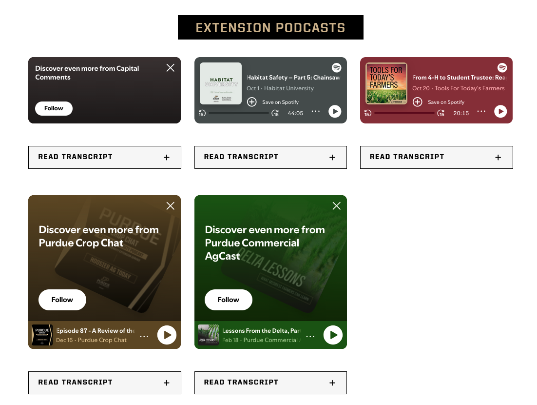
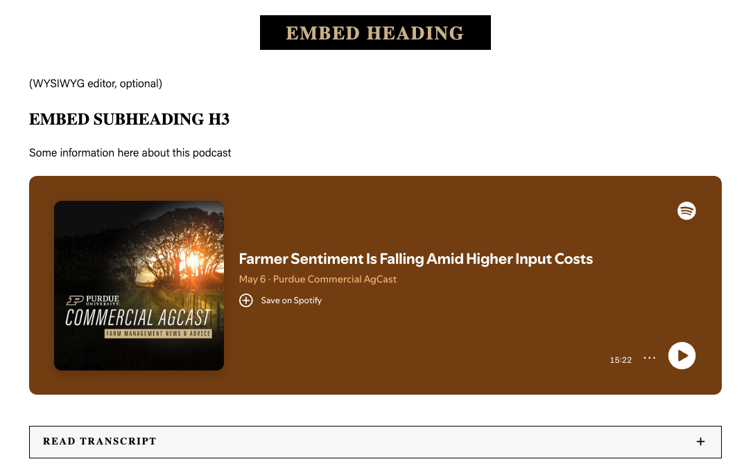
Note: You can use either a Spotify episode URL or a Spotify show URL in the Embed block.
- If you embed a single episode, the embed will display in Spotify’s smaller format.
- If you embed a show, the embed will display in larger format, with automatic updates (because following the show)
- Episode embeds do not update automatically because they point to one fixed episode. Spotify uses a smaller design for individual episodes, and this layout cannot be changed to match the larger show-embed style.
Recommendation:
If you are embedding a show, consider setting a review date or task date on the page. This will remind you to update the transcript as a new episode replaces the current one.
Configuring the survey Embed
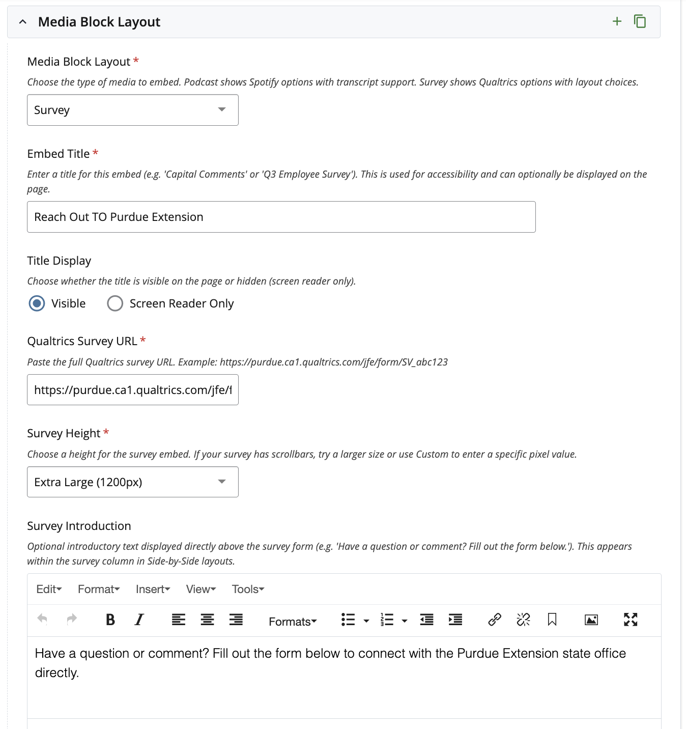
1. Add a Heading and Optional Description
You may include a heading and, if needed, a short description. A dedicated text area will be available for this information.
2. Add Items to Your Embed Block
Once you select survey as Media Block Layout, you want to include:
-
Embed Title: enter a title for the embedded item.
-
Platform: select the platform. Currently, only Qualtrics is supported.
-
Qualtrics Survey URL: paste the Qualtrics link.
-
Survey height: select the height option that best fits your layout and content requirements.
-
Survey Introduction: optional introductory text displayed directly above the survey form (e.g. 'Have a question or comment? Fill out the form below.'). This appears within the survey column in Side-by-Side layouts.
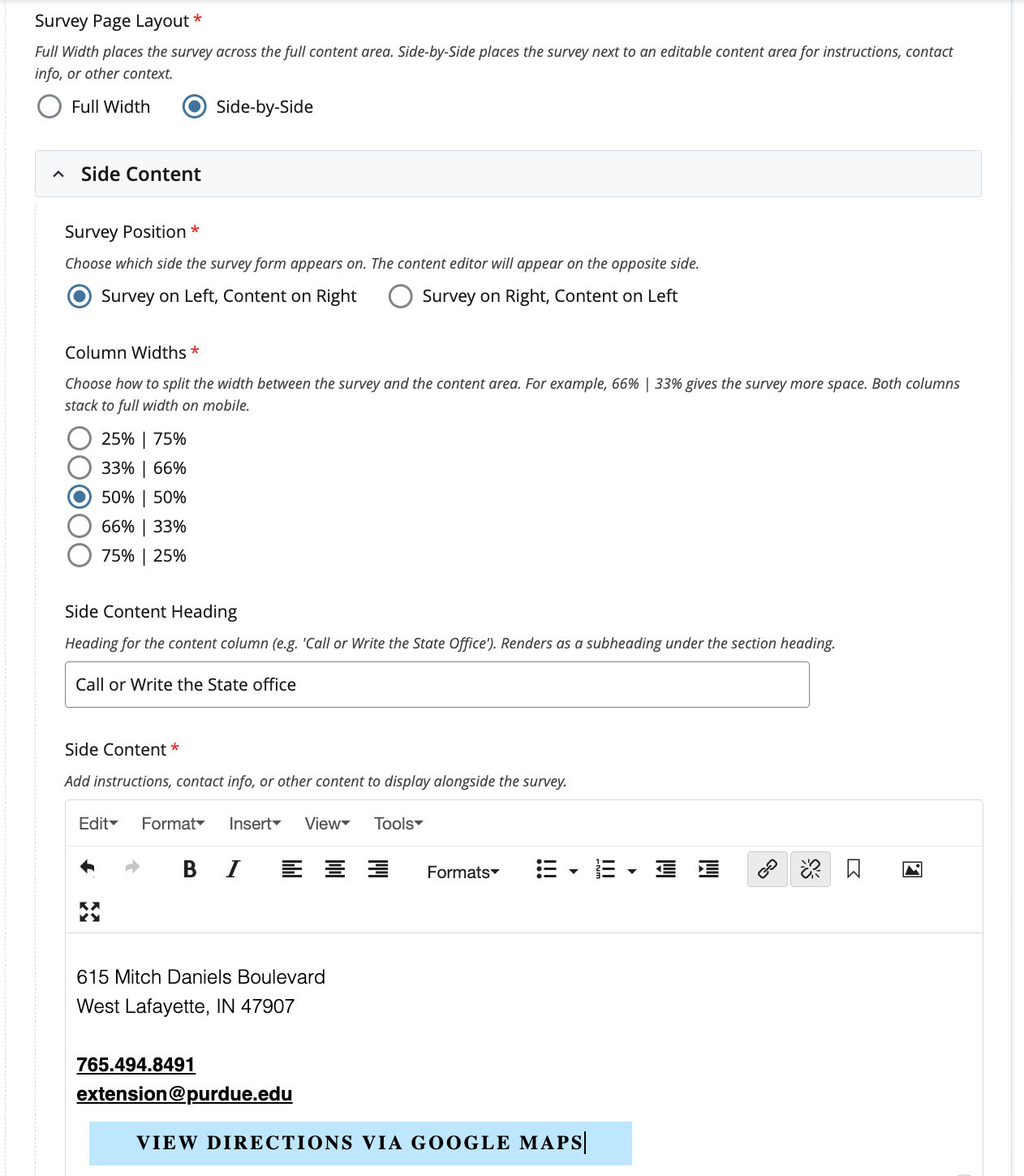
- Survey Page Layout: choose how the survey appears on the page:
- Column Widths: choose how to split the width between the survey and the content area. For example, 66% | 33% gives the survey more space. Both columns stack to full width on mobile.
- Side Content Heading: this would be the heading for the content column (e.g. 'Call or Write the State Office'). It displays as a subheading under the section heading.
- Side Content: add instructions, contact info, or other content to display alongside the survey.
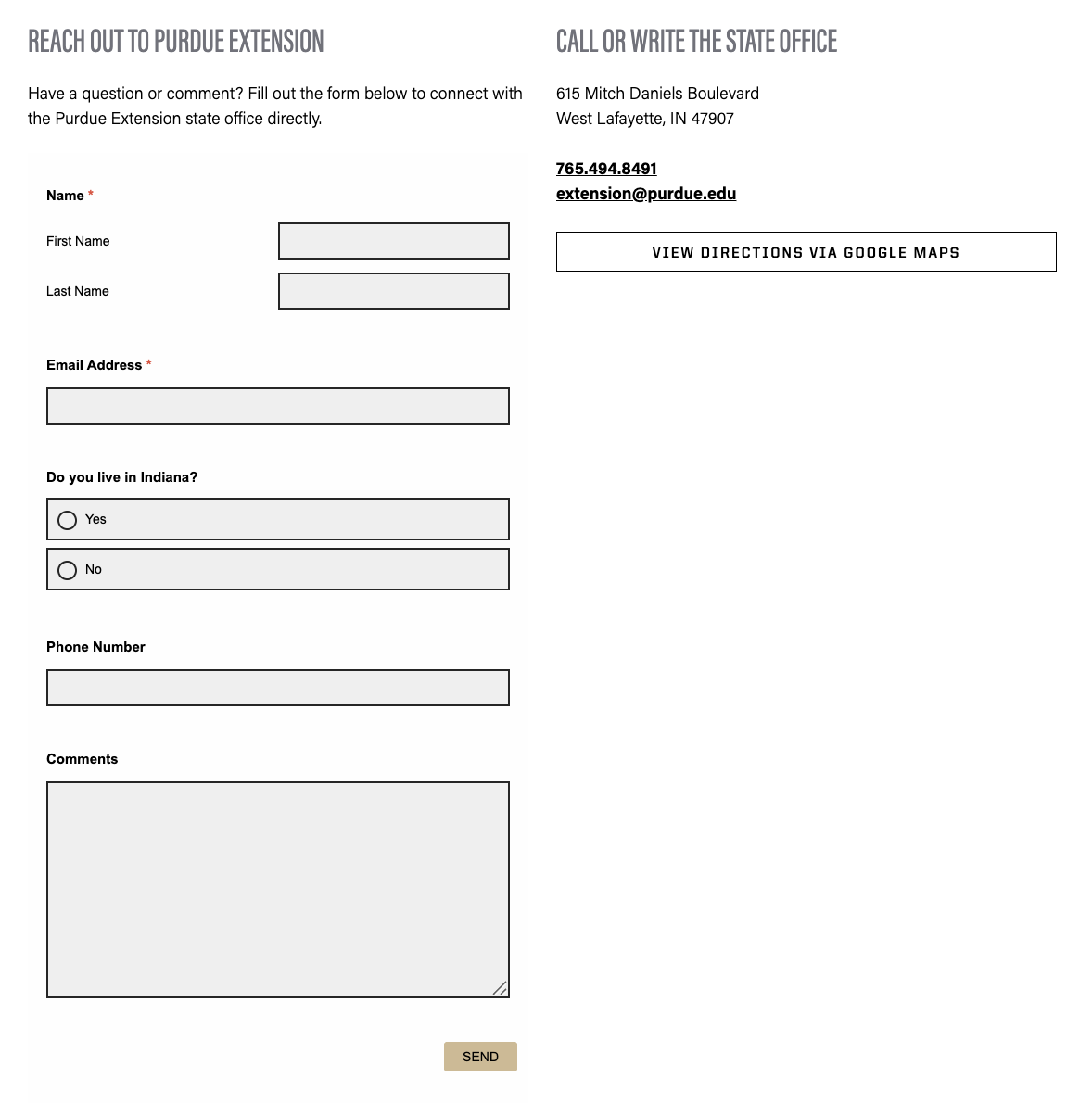
Survey Embed display
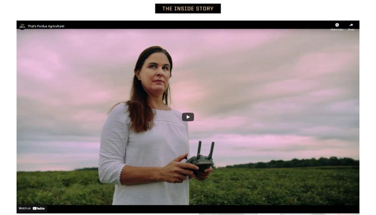
what is a fullwidth video block?
A fullwidth video block is used to embed a full width YouTube video on a page.
The best example of a fullwidth video block is this visual example:
form EXAMPLE and options
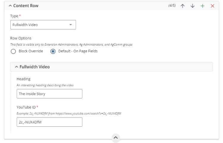
- section heading
- YouTube video ID entry to pull the video from
FAQ
Q: How many fullwidth video blocks can I have per page?
A: One per page is the max. However, you can use direct links, other video blocks and any call-to-action options to link to other web videos on a page.
Q: Are there other ways to embed a video on a page?
A: Yes. The responsive video block and any WYSIWYG editor have options to embed video media on a page. These options do not use the full width of a page to display a video.
Q: Can I set YouTube parameters for embedded videos?
A: Certainly! When you stop or finish a YouTube video, you often are presented with other videos that are related to your own viewing history or random videos YouTube recommends. But if you want to show viewers only videos from your channel, you can add “?rel=0” at the end of the video link. For example, if your video link is SGzMD2TTeqU, you can change it to SGzMD2TTeqU?rel=0. Learn more about YouTube Player Parameters.
Q: Can I chain YouTube parameters for embedded videos?
A: Yes. Here is an example using multiple YouTube parameters using the same example listed above: SGzMD2TTeqU?autoplay=1&start=20&end=25&loop=1&?rel=0&
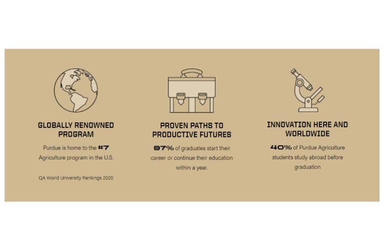
what is a POINTS OF PRIDE block?
A points of pride block is used to showcase facts on a page. For example, a department's national rank standing. Or a county's outreach statistics for an outreach program. This block offers two display layouts: standard and cards.
Standard layout
This layout offers the flexibility to display:
- an Icon Image
- a Title
- a small description, and
- a source
It also allows to have a background color (boiler gold, dust, light gray and white). The best example of a points of pride block is this visual example:
form EXAMPLE and options
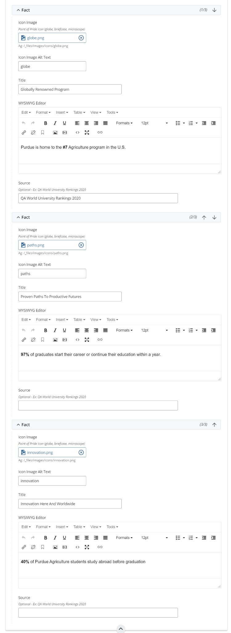
- icon image using Font Awesome as a resource
- icon image alt text to support ADA requirements
- fact title heading
- WYSIWYG text editor for fact body text
- fact source
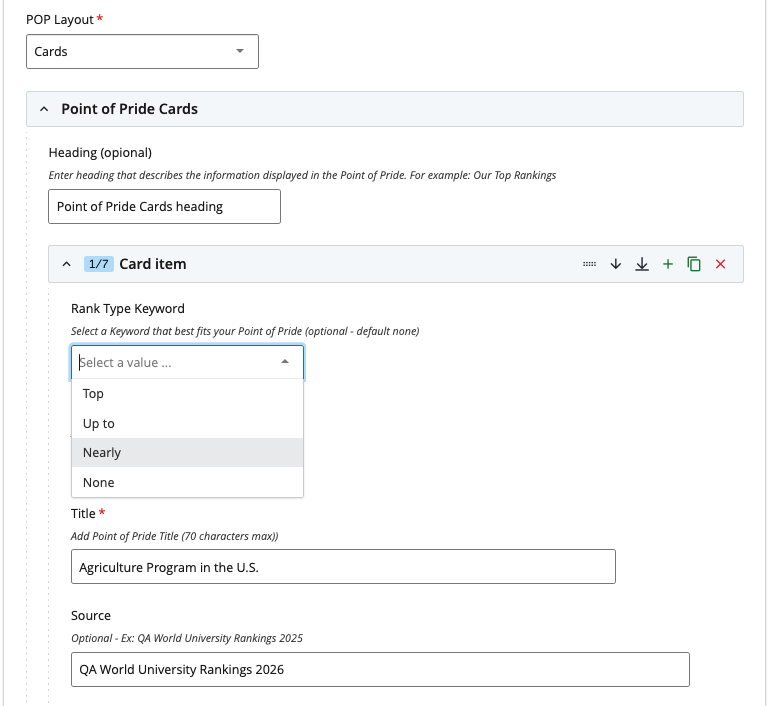
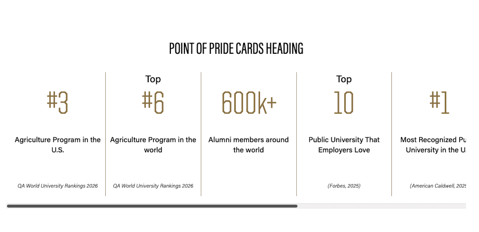
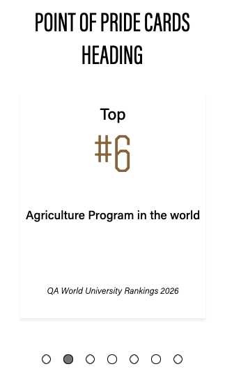
Cards layout
This is a new layout option for the Points of Pride Block. This layout organizes the points of pride into cards with a right border. It uses a scrollbar for navigation between points of pride on desktop and indicators for mobile.
It offers the flexibility to display:
- a Heading (optional)
- a Rank Type keyword at the top (optional, for example: “Up to,” “Top,” or “Nearly”),
- a statistic number or short word (max 10),
- a title or description, and
- a source (optional).
This version also allows users to apply a custom color to the statistic number and to the right border of the card. The default color is black, see example:
form EXAMPLE and options
FAQ
Standard layout
Q: How many facts can I list per block?
A: Three.
Q: Where are icons located?
A: Browse via the block form to the directory listed in the Icon Image field's note. The Ag site's: /_files/images/icons/ directory.
Q: Can I request an icon?
A: Yes. Send a request to the web team.
Cards layout
Q: How many facts can I list per block?
A: Ten.
Q: What is the minimum of facts can I list on this option?
A: Three.
Q: can I add images on this option?
A: No. This option allows just text.
what is a responsive video block?
A responsive video block is used to embed a YouTube video on a page.
The best example of a responsive video block is this visual example:
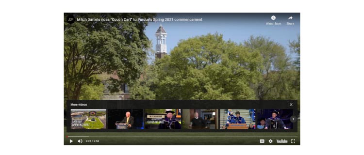
form EXAMPLE and options
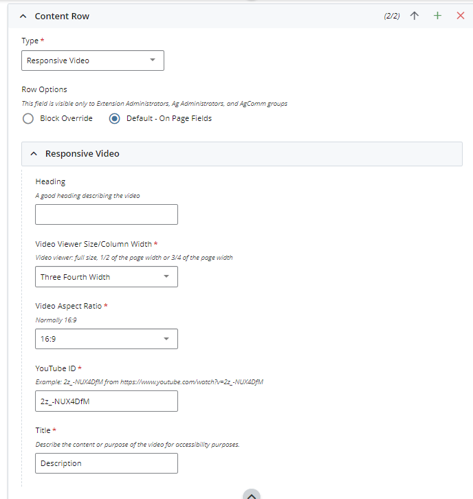
- heading (ADA compliance)
- video block width options
- video aspect ratio options (learn more)
- YouTube ID field
- title of the video (ADA compliance)
FAQ
Q: Are there other ways to embed a video on a page?
A: Yes. The full-width video block and any WYSIWYG editor have the option to embed video media on a page.
Q: Can I set YouTube parameters for embedded videos?
A: Certainly! When you stop or finish a YouTube video, you often are presented with other videos that are related to your own viewing history or random videos YouTube recommends. But if you want to show viewers only videos from your channel, you can add “?rel=0” at the end of the video link. For example, if your video link is SGzMD2TTeqU, you can change it to SGzMD2TTeqU?rel=0. Learn more about YouTube Player Parameters
Q: Can I chain YouTube parameters for embedded videos?
A: Yes. Here is an example using multiple YouTube parameters using the same example listed above: SGzMD2TTeqU?autoplay=1&start=20&end=25&loop=1&rel=0&
what is a RSS block?
A RSS block is used to pull in a single remote RSS feed via XML to a page.
The best example of a RSS block is this visual example:

form EXAMPLE and options
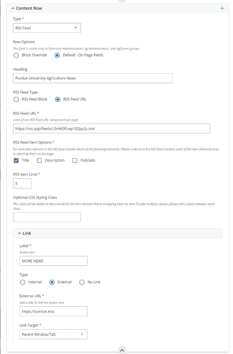
- section heading
- block or URL choice (block uses a single URL, but can be used on multiple pages)
- URL address for remote XML feed or use a feed block located at Add Content > User Blocks
- RSS feed display options
- RSS page listing limit of 1 to 5 articles
- Optional CSS classes to edit on page text styling
- Call-to-action link section
FAQ
Q: How can I overcome RSS feed remote push/pull errors or poorly configured XML issues (CORS errors)?
A: We have had luck using third-party tools to re-direct RSS XML. Contact the Agcomm Web Team to learn more.
Q: Can a page have more than one RSS feed?
A: No. The page coding does not allow this. Users can however use a WYSIWYG block to direct users to other RSS feeds, sources, or to other pages on their site.
what is a social media block?
A social media block is used to embed TrueLoyal.com (previously Tint) export code into a page. This third-party tool is used by Purdue to provide aggregated social media feeds into a page.
The best example of a social media block is this visual example:
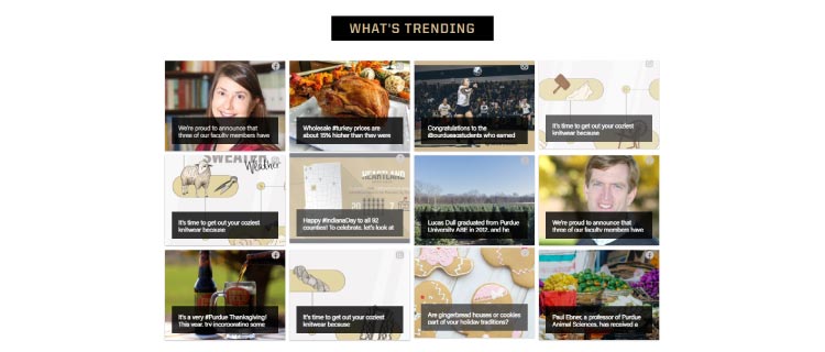
form EXAMPLE and options
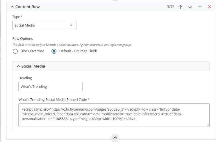
- section heading
- trueloyal.com script code embed
FAQ
Q: Can I embed social media feeds using another tool?
A: Yes. Some third-party tools may work by embedding their export code into the embed form.
Q: How do I establish a trueloyal.com account?
A: This TrueLoyal setup and support page has the information you need to create a Tint account.
blocks for images
what is a Centered image block?
The centered image block adds the ability to showcase a single image on any Cascade Page.
The best example of a centered image block is this visual example: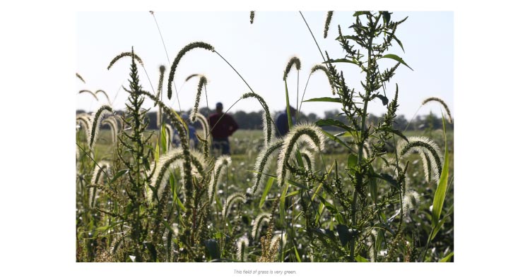
form example and options
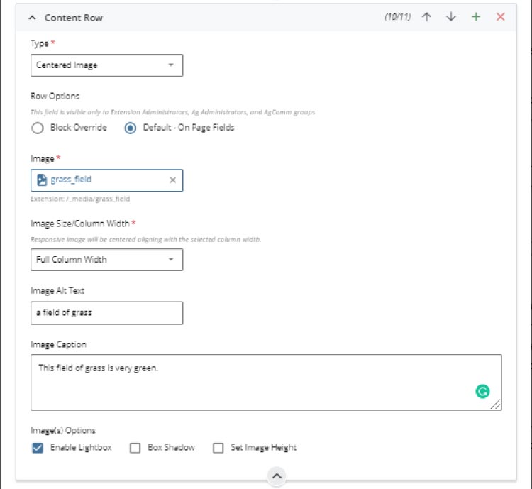
- Image selector
- Image Size/Column Width controls how much of the page body the image will use
- Image Alt Text
- Image Caption
- Image Options
- Enable Lightbox: adds a pop-up image viewer
- Box Shadow: adds a light shadow to an image
- Set Image Height: override to control height of larger images
FAQ
Q: Doesn't the WYSIWYG editor also do this?
A: Yes. However, this option makes it easier to do and will not cause CSS code and alignment issues.
what is a full width image block?
The full width image block adds the ability to showcase a clickable (or not) full-width lower page body hero-type image on any Cascade Page.
The best example of a full width image block is this visual example:
form example and options
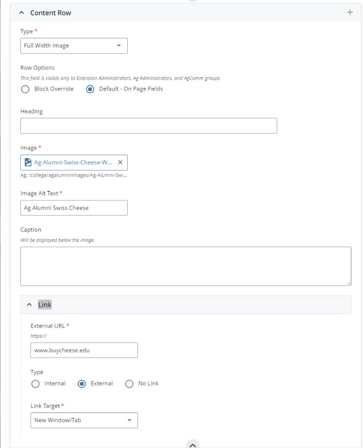
- Image heading
- Image Alt Text (very important for ADA support, see FAQ below)
- Caption for image
- Image link (content consumers click the image for call-to-action)
FAQ
Q: Does the image require a header and caption?
A: No. The minimum requirement is alt text to support ADA needs for all content consumers, as not all text readers cannot read the text in the image.
what is an image group block?
The image group block adds the ability to showcase a row of up to four images (in a row) on any Cascade Page.
The best example of a centered image block is this visual example:
form example and options
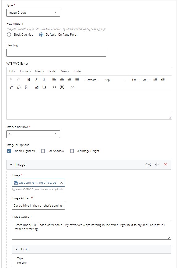
- Heading
- WYSIWYG Editor
- Images per Row (up to four images are possible)
Note: There is no limit on the number of images you can add. - Image Options
- Enable Lightbox: adds a pop-up image viewer. Note: The linked image option is disabled if you choose to use a Lightbox.
- Box Shadow: adds a light shadow to an image
- Set Image Height: override to control the image height of larger images
- Image selector
- Image Alt Text
- Image Caption
- Image Link
Note: Choose the + symbol to add each image and update the alt text and captions.
FAQ
Q: Doesn't the WYSIWYG editor also do this?
A: Yes. However, this option makes it easier to do and will not cause CSS code and alignment issues.
Q: How can I share more than four images?
A: Add additional image group blocks block to the page.
Q: How do I link images to other resources?
A: Disable the Lightbox option. Another option is to use the Linked Image Group block instead.
what is a linked image group block?
The linked image group block is similar to the image group (with image options) block. However, this version makes it easier to showcase a row of up to four linked and clickable images (in a row) on any Cascade Page. This block form is similar to the image group block form, but it does not have the extra image choices such as the Lightbox option, which disables direct linking.
The best example of a linked image block is this visual example, which shows a row of logos. Each logo is linked to a different website:
form example and options
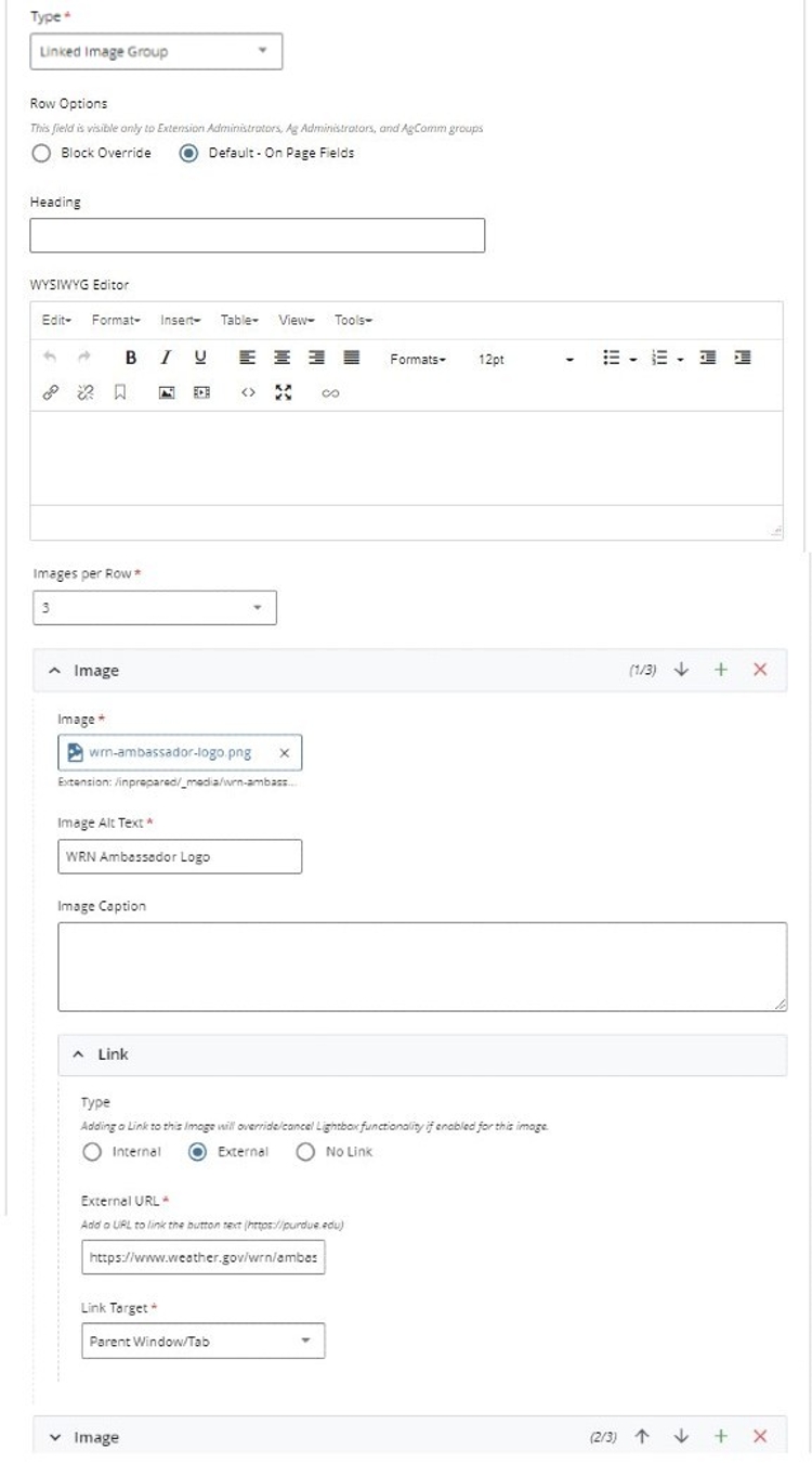
- Heading
- WYSIWYG Editor
- Images per Row (up to four images are possible)
Note: There is no limit on the number of images you can add. - Image selector
- Image Alt Text
- Image Caption
- Image Link
Note: Choose the + symbol to add each image and update the alt text and captions.
FAQ
Q: Doesn't the WYSIWYG editor also do this?
A: Yes. However, this option makes it easier to do and will not cause CSS code and alignment issues.
Q: How can I share more than four images?
A: Add additional image group blocks block to the page.
Q: How can I show a Lightbox image gallery?
A: Use an Image Group (with image options) block for more options.
what is an image gallery block?
The image gallery block is an easy way to add multiple images to a page and allow them to be displayed in fun and creative ways. For example:
The best example of a gallery block is this visual example, which shows a mosaic of cat images: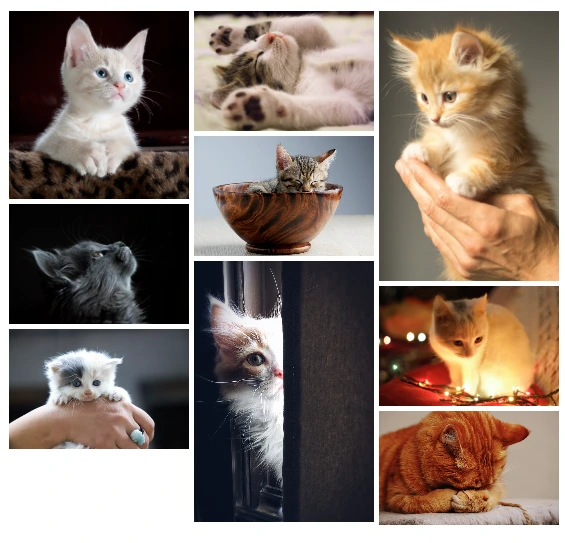
form example and options
Steps to add an image gallery:
Step 1 - Establishing a media gallery folder:
Note: This step requires a project request to establish.
- Log in to Cascade and navigate to the site folder to which you would like to add your gallery
- Click + Add Content
- Choose Blocks, then Image Gallery, and Media Gallery Folder
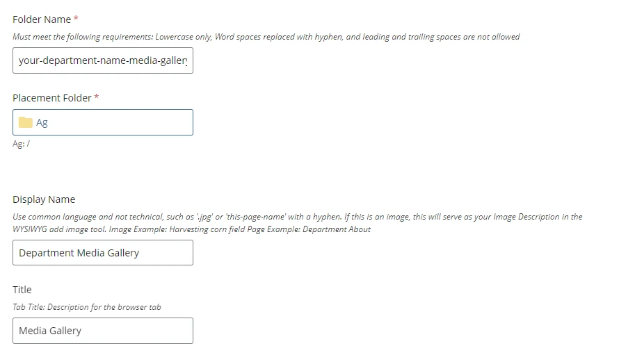
- Provide a folder name for your gallery, such as your-department-name-media-gallery
- Edit the Display Name and Title to display as you want
- Click Submit
Step 2 - Adding media (images):
- Click + Add Content
- Click Add Image for Gallery
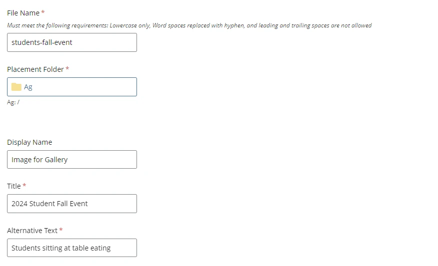
- Provide a file name for your image
- Add an image title for your image
- Add Alternative Text to make your image ADA compliant
- Click Submit
Note: A media gallery folder needs at least 3 or more images to load a gallery on a Cascade page.
Note: Do not mass upload images using other Cascade options. This will bypass the needed image tags to ensure your gallery is ADA compliant.
Step 3 - Adjusting your gallery's look:
There are four style choices for Cascade media galleries:
- Mosaic gallery - The mosaic grid arrangement can be modified to determine where and what size each image is.
- Cascading gallery (Fixed Width) - The width is fixed at a set number of pixels for each image, while the height is scaled to keep image aspect ratio. Adjust width to change how many columns you get. Images are displayed in folder order by default.
- Justified gallery - (Fixed Height): The height is fixed at a set number of pixels for each image, while the width scales to maintain the image's aspect ratio. Adjust height to change how tall each row is. Images are displayed in folder order by default.
- Slider gallery - The slider is really a justified layout with a maximum of one row. A large size is recommended in order to fill the entire screen with one image. This gallery has the lightbox pop-up disabled and the order of the media randomized on page load.
To change your gallery style visit your media gallery folder and edit the gallery block to choose one of the four gallery options listed above.
Step 4 - Adding your gallery to a Cascade page:
- Edit the Cascade page you want to display your gallery on
- Add a new Content Row and select Gallery
- Select your gallery block from your media gallery folder and click Submit to see your gallery displayed on the page
FAQ
Q: Can I mass upload images to a gallery?
A: No. Each image must be uploaded using the Add Image for Gallery option and steps listed above to ensure ADA compliance.
FAQ
Q: Where can I view active block examples?
A: Every Cascade page showcases different combinations of blocks. However, this live example exhibits each block type individually. Note: This page may take some time to load due to the heavy coding required to display all the blocks on a single page.
Q: Can I use a block on multiple site(s) and pages(s)?
A: Yes. Using a Block Override instead of the Default - On Page form option allows for this. Contact Cascade support if you need help setting this up.
Q: Where can I learn more about adjusting site navigation blocks?
A: Find how-to edit navigation on a site here.
Q: How can I get a Cascade Account?
A: Start here.
Q: How do I create a Cascade Page?
A: Learn how here.