

Dig into Data within Your Spreadsheets
In this Digging into the Data Pipeline presentation, Dennis Buckmaster, professor of Agricultural and Biological Engineering at Purdue University takes a deeper dive into how to manipulate data within a spreadsheet, including using pivot tables, filters and charts. Buckmaster walks viewers through examples using data samples from a dairy farm.
View the Digging into Your Data within Spreadsheets presentation video here.
This video presentation is part of the Digging into the Data Pipeline webinar series hosted by the College of Agriculture at Purdue University.
View the Digging into the Data Pipeline playlist on Youtube.
This series is supported in part by the Wabash Heartland Innovation Network (WHIN).
Digital Agriculture Posts

Even if you don’t know much about beef or dairy production, if you imagine a ranch or a...
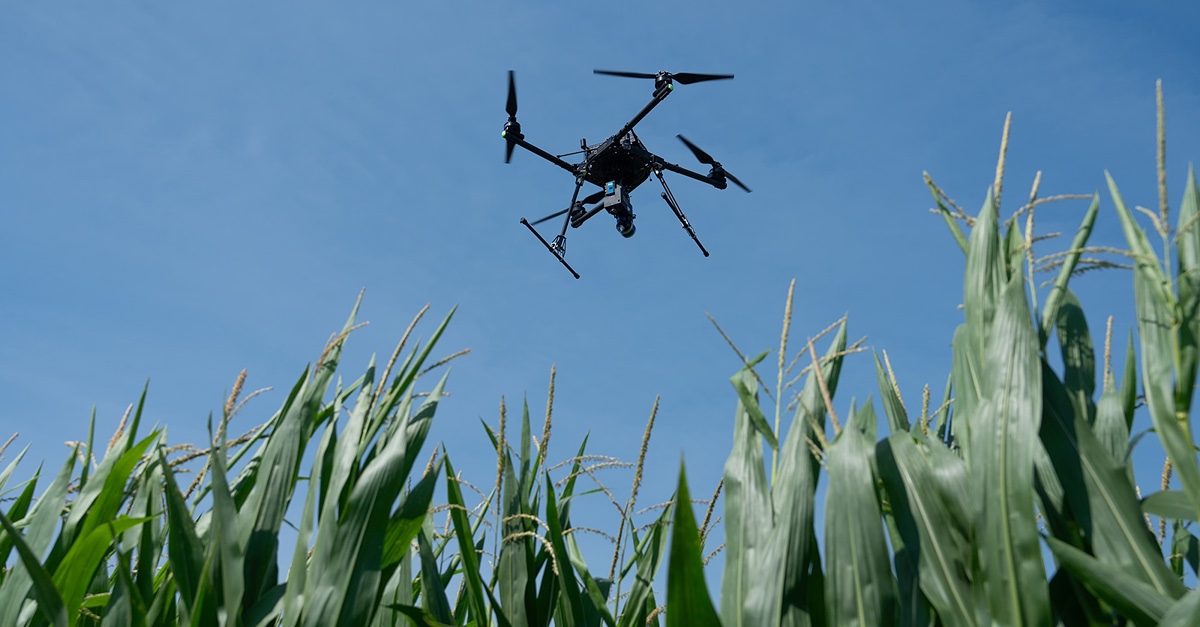
On any given day in Indiana, you will find farmers checking weather apps before sunrise,...
Keeping records of events, transactions, and important activities can be simplified using digital...

Herd records (breeding, pregnancy checks, births, weaning, treatments, etc.) have value from...
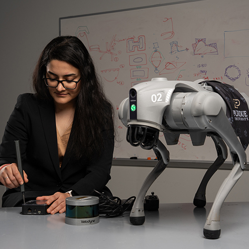
Purdue Agriculture researchers are harnessing the power of artificial intelligence (AI) and...
Purdue University’s College of Agriculture recently welcomed Ignacio Ciampitti, an...