January 1, 2014
Effective Price Comparison of Indiana Crops for New Farm Programs
![]()
![]()
![]()
![]()
![]()
This fall crop producers will be asked to make their choice among three very different safety net programs newly created as part of the 2014 Farm Bill. Online decision aids promise to provide a bevy of information that farmers will need to process in deciding which program path best fits their operation and tolerance for risk. A key part of being able to process information derived from the online decision tools is a fundamental understanding of each program’s operation. It is especially important to understand how payments respond to changes in prices. One way to do this is to examine the effective price resulting from each program, i.e. the market price plus the estimated subsidy revenue (per bushel) a farmer receives under each program for a range of possible market scenarios.
In this article we present effective price comparisons between Price Loss Coverage (PLC) and Agricultural Risk Coverage-County (ARC-C) programs. These are the two programs that are likely to be most attractive to Midwest corn and soybean producers. Moreover, these two programs are directly comparable with enrollment available on a crop-by-crop basis. A general strategy for analyzing a farm’s enrollment decision requires a comparison between these two programs for each crop on the farm (Keeney and Ogle 2014).
Calculation of Program Payments and the Effective Price
A simple formula for calculation of the PLC payment on a base acre basis is given below.
PLC = 0.85 × PaymentYield × [Preference – Pmarket]
The 0.85 term in the formula is included as a base reduction factor since farmers are paid on only 85 percent of their base acres. The payment yield is the fixed reference yield for the particular crop on that farm. This will either be the farm’s counter cyclical program (CCP) yields in place since the 2002 farm bill or newly updated yields equal to 90 percent of the average yield for the crop on the farm spanning the 2008-2012 crop years. The final term compares the reference price established in the 2014 Farm Bill to the market price, and is the effective per bushel payment rate.
ARC – C = 0.85 × min[Rguarantee – Ractual, 0.10 × Rbenchmark]
The ARC-C payment per acre is given in the simplified formula above on a per base acre basis. Like the PLC programs, payments are only made on 85 percent of the total base acreage. In contrast to the PLC program, which compares only prices, the ARC-C payment is determined by a comparison of revenues (Ri). Thus, both prices and yields will affect the ARC-C payment. The three revenues to be used in the calculation are the benchmark, guarantee, and actual. The benchmark revenue is the moving average revenue established for the county for a particular crop and is calculated by multiplying the Olympic moving average yields and Olympic2 moving average price for the most recent 5-year period. The guarantee revenue is calculated as 86 percent of the benchmark revenue. Actual revenue is the measure of current year’s revenue performance for the county based on the county’s yield (as estimated by USDA-NASS) multiplied by the national average marketing year cash price. If the actual revenue exceeds the revenue guarantee, no payment is made. If the actual revenue falls below the revenue guarantee, it triggers a payment equal to the difference between the revenue guarantee and actual county revenue, times 0.85 since payments are only made on 85 percent of the base acres. Finally, if the difference between the revenue guarantee and the actual revenue exceeds 10 percent of the benchmark revenue (the upper limit for annual ARC-C payments), the ARC-C payment to the farmer is capped at 10 percent of the benchmark revenue.
The procedure outline above calculates both the ARC-C and PLC payments on a per acre basis. By dividing both the ARC-C and PLC payments by the same yield, it is possible to compute an “effective price” that includes both revenue derived from the market and revenue from the ARC-C or PLC programs3, respectively. It is helpful to look at the payments in this way because the effective prices are in the same terms as the market price variable driving variation in the subsidy levels.
Information for Program Calculations
Table 1 provides national marketing year average prices for the 2009 through 2013 crop years for corn, soybeans, and wheat. The last column calculates the five-year Olympic average for this time frame. The strong price performance of this five-year span is immediately evident as there is a significant amount of price protection built into the ARC-C program, just based on recent market performance.
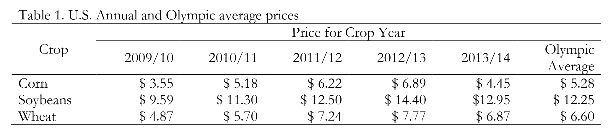
Table 1. U.S. Annual and Olympic average prices
Table 2 compares price protection provided by ARC-C and the PLC reference prices for corn, soybeans, and wheat. To make this comparison, the “trigger” price for ARC-C payments was computed by multiplying the 5-year Olympic moving average price by 86 percent since ARC-C payments begin when county revenue falls more than 14 percent below the benchmark revenue. Note, however, that since ARC-C payments are triggered by revenue shortfalls relative to a county benchmark, these “trigger prices” are only correct for an individual county when the county yield exactly matches the Olympic average yield for that county. Despite this limitation, it is instructive to examine the differences in coverage provided by the two programs.
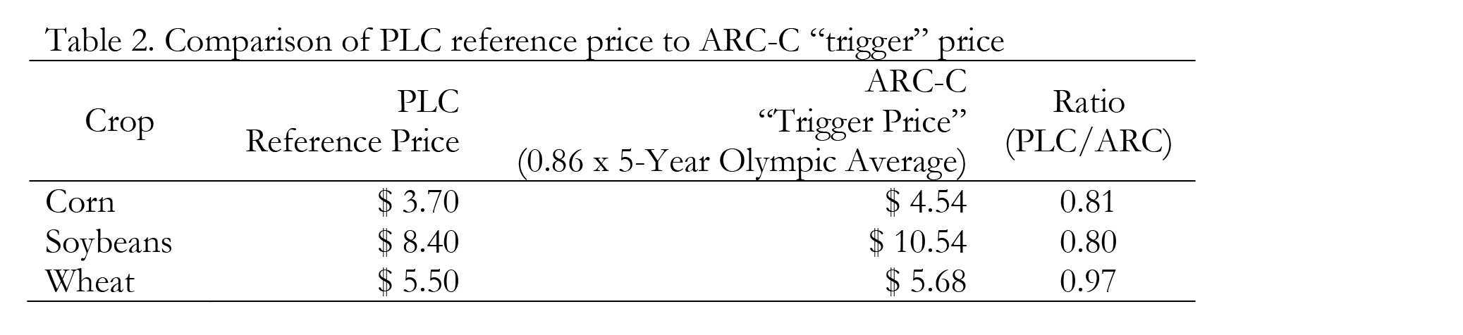
Table 2. Comparison of PLC reference price to ARC-C “trigger” price
Under the assumption that the county yield equals the Olympic average yield, the ARC-C program starts to provide payments when prices fall below $4.54, $10.54, and $5.68 per bushel for corn, soybeans, and wheat, respectively. In contrast, the PLC program does not begin to provide payments for corn and soybeans until marketing year average prices fall approximately 20 percent below the ARC-C price “trigger level”. This is a key distinction between the ARC-C and PLC programs and is one reason why the ARC-C programs is often referred to as a shallow loss program since it provides income support in the event of a modest (14 percent) decline in revenue below the benchmark revenue. This contrasts with the PLC program, which does not provide income support until a much larger price decline occurs. However, there is a tradeoff since ARC-C payments are capped at 10 percent of the benchmark revenue whereas PLC payments continue to increase as prices decline, potentially all the way to each crop’s loan rate.
Comparison of Effective Prices: PLC vs ARC-C
Since the PLC and ARC-C programs operate very differently, it’s helpful to compare effective prices realized via participation in the two programs for various marketing year average prices. Figure 1 demonstrates the very different nature of these programs for corn. On the horizontal axis actual marketing year average cash prices are depicted while the vertical axis provides the effective price, i.e. the market price plus revenue from the ARC-C or PLC programs divided by actual yield. Of course an individual farms’ actual price will depend on marketing and other factors so we are using the program’s version of an average market price received. Because ARC-C payments depend on yields, the payment and therefore the effective price depend on that yield. A simplifying assumption making yields exactly equal to Olympic average yields is adopted in calculations presented here. As has been the case for some time, government programs are no substitute for an efficient marketing plan that allows farmers to maximize returns for the harvested commodity.
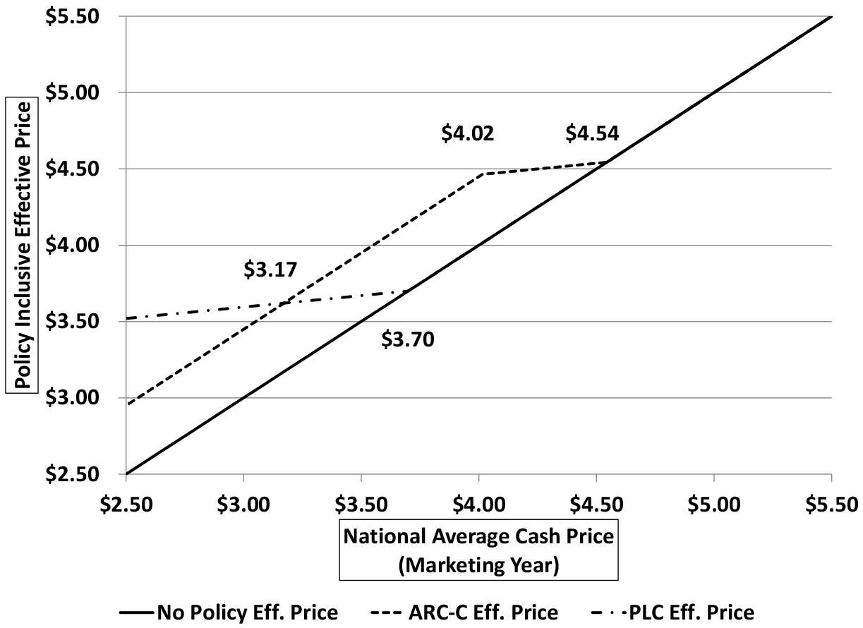
Figure 1. Comparison of program effective price performance, Corn (using Indiana state level data)
Moving from right to left on the horizontal axis, we see that all three price lines (market, ARC-C effective price, PLC effective price) are identical until we reach a marketing year average cash price of approximately $4.54 per bushel when ARC-C payments are triggered. ARC-C payments increase as prices decline, slowing the decline in effective price until the ARC-C cap of 10 percent is reached at a market price of $4.02 per bushel. In contrast, PLC payments are not triggered until the marketing year average cash prices falls below the $3.70 per bushel reference price. PLC payments similarly augment the market price and increase as market price falls.
Since ARC-C payments are initiated at a higher marketing year average cash price, and payments under both programs increase as prices decline, the ARC-C effective price remains above the PLC effective price until PLC payments are large enough to overcome the 10% of benchmark revenue cap in the ARC-C program. This does not take place until the corn marketing year average cash prices declines to approximately $3.17 per bushel given the yield assumption made here. Increasing the yield assumption will tend to lower the ARC-C “trigger price” and do so at a faster rate than the price where ARC-C exactly equals PLC (i.e. where the effective price lines intersect).
We provide the same graphic for soybeans in figure 2, comparing the expected per bushel revenue with participation in the PLC pprogram, ARC-C program, and without government program participation. The pattern for comparing the net effect of the program in terms of effective prices is the same, beginning with the ARC-C “trigger” at $10.54 (see table 2). ARC-C provides strong support for more meager declines in price, but only for a small range of that decline as the enforcement of the 10% cap limits payout. ARC-C reaches its limit payment prior to the $8.40 trigger of the PLC program being reached at $9.31 and program performance is equal at a price of $7.18. As with corn, it is important to recognize the yield assumption’s importance in identifying the ARC-C trigger. In a subsequent publication we will explore the role of yield performance in ARC-C expected payouts since county to county variations is destined to play a pivotal role in program preferences across the geography of Indiana.
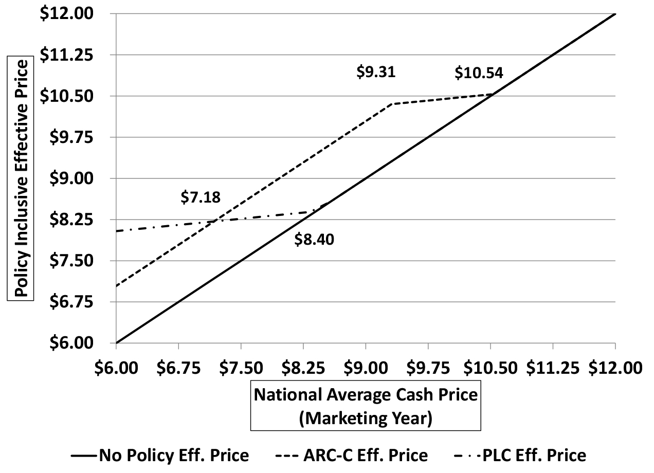
Figure 2. Comparison of program effective price performance, Soybeans (using Indiana state level data)
Concluding Thoughts
The comparisons between the two programs in figure 1 and figure 2, despite using specific price and yield scenarios, are actually quite general. The shape of the lines for each program relative to the market price will be the same, only the location will adjust depending on yield and price for the ARC-C program and price for the PLC program. The relatively large “trigger” values for ARC-C shown in table 2 are what determine the relative positions of the program effective ranges. Wheat was shown in table 2 to have a narrower gap between the ARC-C “trigger” and PLC reference price. As a result, it will have a more limited overlap.
As producers move forward with their election this winter, it is important to remember that the choice made is irrevocable and will determine their commodity program payouts for all crop years through 2018 and perhaps beyond if the 2014 Farm Bill is extended. The comparison of payments made here is heavily influenced by the recent five years of prices that were well above PLC reference levels. If prices continue to fall, so too will the overlap of the effective area of the programs since the moving average will begin dropping higher prices and adding lower prices. For all three crops discussed in this article, the 2009 crop year prices were relatively high. This means that the ARC-C “trigger” prices in effect for 2015 are guaranteed to be at or above the 2014 levels.
Farmers are going to have many tools at their disposal to compare the ARC-C and PLC programs. As they enter data into these tools, it is important to keep the nature of the programs in mind and to remember how each program separately supports farm revenue. Using effective prices, as we illustrated above, provides a general comparison of the programs. Numbers from online decision tools should replicate this with numerical results and these graphs should provide the correct context for comparing those numbers as farmers begin the process of evaluating program election and how well it fits into their overall production, marketing, and risk management plans.
Reference
Keeney, R. and T. Ogle. 2014 “Weighing Crop Program Alternatives in the 2014 Farm Bill.”
June Issue of Purdue Agricultural Economics Report, Purdue University.
![]()
![]()
![]()
![]()
![]()
TAGS:
TEAM LINKS:
RELATED RESOURCES
UPCOMING EVENTS
We are taking a short break, but please plan to join us at one of our future programs that is a little farther in the future.